20 Google Ads Search and Display Ad Best Practices (Checklist Included)
Creating an attention-grabbing, emotion-evoking ad creative can be one of the most daunting tasks a marketer can undertake.
Nevertheless, a powerful ad creative can be one of the best investments a business can make, skyrocketing click-through-rates, conversions, and profits.
Here are 21 best practices you can follow when creating your next text and display ad creatives.
Understand the Objectives of Your Target Audience
This should be the first thing you spend some time thinking about before picking up that palette and brush.
Nothing gets more ignored than seeing something we don’t care about. Think about what the user might be looking for when they’re Googling “cheap hotels”.
Would your ad stand out if you mentioned “luxury hotel” or “five star hotel” in your headline? What about the terms “budget hotel” or “from $30 a night”? You get what I mean.
Focus on How it Benefits Them
[easy-tweet tweet=”People don’t get excited over how great your product is. They get excited how your product can make their lives great” via=”no” usehashtags=”no” url=”http://goo.gl/wSqymR”]
A great example by Uber on highlighting the potential benefits of driving with Uber:
Here’s a list of phrases that convey consumer benefits:
- Free shipping
- Free returns
- Free trials
- Time saving
- Access from anywhere
- Convenient
- Easy to use
- Hassle-free
- Save more when you buy…
Speak to One Specific Target Audience
Ever heard the saying, “For you to succeed in business… You’ve got to be be able to solve a very specific problem for a very specific person.” Or the saying, “Try to appeal to everyone, and you’ll sell to no one”? It’s a little extreme, but the message here is to be specific.
Enter the mind of one specific customer you’ve served. Listen to the conversation that’s going on in her head, engage in a conversation with her, and be specific when talking about your offer.
If she uses words like “condo” instead of “condominium” or “car” instead of “auto-mobile”, speak in her lingo.
Have a Compelling Offer
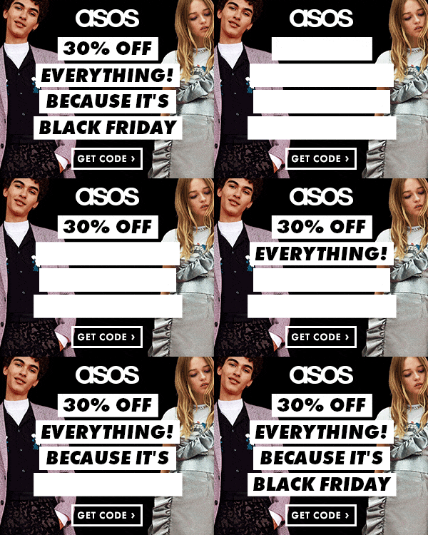
We’ve all had a moment where we gave in to an offer we couldn’t resist. Consider these examples of compelling offers:
Ad 1
Ad 2
For Ad 1, 30% off everything without any * with terms and conditions apply sounds pretty transparent and attractive.
For Ad 2, free delivery and 30-day free returns sounds like a real bargain.
The key is to make your offer compelling and irresistible.
Make Your Offers Easy to Comprehend
Here’s a golden rule to follow when writing your ad copy – K.I.S.S.
Keep it simple. People are so busy about their lives, they’re often lazy to rethink an offer. Consider the following ad variations:
Ad Variation 1
Purchase any two phone cases at 25% discount and get a third one for free.
Ad Variation 2
All phone cases at $5 each with minimum purchase of 3 items.
Both ads basically offer phone cases at $5 per piece. Assuming $5 is below the market rate, it sounds attractive as it is.
When you see Ad 2 as a consumer, you don’t have to crack your brains to know you can get the best deal as long as you purchase at least 3 items.
Be Specific
I can’t stress this enough. Being specific clears the air of mystery. It conveys transparency and trust.
Talking about fast shipping? How about stating exactly how many days it takes?
Offering the best deal? How about going into specific details like DirectAsia? – No Agency Commission and 0% Monthly Instalments.
Consider the following variations. Which do you think is more specific and appealing?
Ad Variation 1
Attend a course for $0 for when you claim your $500 SkillsFuture credit from the government.
Ad Variation 2
Attend a course at ABC Hub Academy. All courses are SkillsFuture Claimable.
Include a Relevant Call to Action
A call to action or CTA is one of the most important elements of an ad creative. It gives your ad purpose, reinforces what you have to offer, and tells the prospect what to do. Without it, your ad loses its significance.
You should really take your time to think about this one and not rush with whatever comes to your mind. Your CTA message should be relevant to whatever your prospect is thinking of doing (intent) when she saw your ad.
Here’s a decent search ad that showed for the query “last minute hotel deals”.
If you’re thinking of finding last minute hotel deals, what could be more relevant than a comparison engine that helps you “Find Cheap Last Minute Hotels by Comparing 100s of Sites at Once”?
Display Credibility and Reliability
While everyone’s offering roughly the same features and benefits as you, how do you stand out?
By displaying social proof, status, and reliability.
Social proof
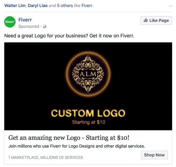
Facebook sponsored newsfeed ads automatically do a great job at this.
If you target your ad to the friends of your existing customers/page fans, your target audience will see that their friends have already liked the brand. Instantly, innate emotions such as FMO (fear of missing out) and being part of a group gets triggered, increasing the chances of them acquainting with your brand.
Status
Check out this paid search ad by Intuit for their accounting software, Quickbooks. – The World’s #1 account software.
People want to be associated with the best. And it takes boldness to proclaim that you’re the number one in the world. But heck if it works, who cares?
Reliability
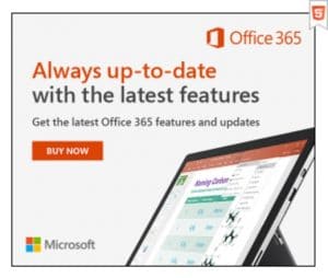
Check out Microsoft Office 365 – Always up-to-date with the latest features.
Be careful not to promise the sky and under deliver here though. You could lose more in the long run, if dissatisfied customers post bad reviews on your false claims all over the internet.
Here are a number of words in the English dictionary that convey reliability (Note: Use them with caution! Some of these terms are perceived as too-good-to-be-true):
- Always/Forever (e.g. Facebook’s homepage – “It’s free and always will be”)
- Guarantee (e.g. Money-back guarantee)
- Warranty (e.g. 5-year warranty)
- Trusted (e.g. Trusted by MNCs)
- Award-Winning (e.g. Award-Winning agency of the year)
Use Words That Trigger Emotions
Emotional triggers. We all have them. They’re either positive or negative depending on the factors that trigger them. Here are some common examples:
- Fun
- Fear of missing out
- Comfort and safety
- Love
- Anger
- Pity
- Excitement
Let’s look at an ad by PETA that triggers anger and pity.
Check out this compelling ad by Harley Davidson – “A ride unlike anything you’ve ever felt before”.
This copy challenges you and creates excitement. That’s a strong emotional trigger.
Compare this with Kawasaki’s ad, which basically tells you what you should do – Click Here to learn more about duh duh duh… Great if you’re well-acquainted with the brand. Not so good if you’ve never heard of or seen a Kawasaki on the roads.
Match Your Ad to Your Landing Page
Imagine seeing a promotional banner offering storewide 50% discount outside a retail shop, and going in only to find out the offer had already expired. It’s an extreme example of false advertising, but you get what I mean.
Speaking about that, what would you do if you encountered a misleading ad? You’d probably feel cheated and walk right out of the store pissed, and you’d probably never return.
If your ad mentions a free trial, make sure the first thing your prospect sees on your landing page when he clicks on your ad are the words “Free Trial” and a call to action leading to his promised free trial.
Check for Grammar and Spelling Mistakes
Give me a silent nod if you get irritated when you see repeatedly see grammar and spelling errors on a document. A few typos here and there are a common occurrence and may sometimes go unnoticed, but you’d still want to avoid any if you can.
Grammatical errors can hurt credibility and lead to fewer sales.
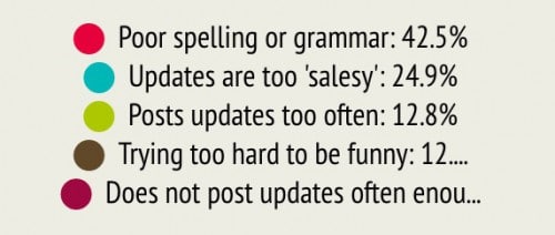
In July 2013 Disruptive Communications asked 1,003 UK consumers what was most likely to damage their opinion of a brand in social media.
Here are the results:
42.5% pointed to poor spelling or grammar as a factor that would damage that opinion of a brand on social media.
Proof read. Proof read. Proof read.
Design Your Ad For Multiple Devices
A display ad that looks great on desktop may not be readable on mobile.
Desktop (looks great):
Mobile (font is too small):
Ad targeting by device can also be specified in your ad platforms such as Google AdWords and Facebook Ads. More and more advertisers are creating at least 2 different ad versions for mobile and desktop devices.
Differentiate Your Ads From Your Competition
Use Google Ads Transparency Center to check out your competitors’ display ads. Google your target keywords and check out your competitors’ text ads.
Take note of what you’re able to offer but they’re not, then highlight what makes you unique. Do your competitors offer free trial? Free shipping? Tax free? Competitive pricing?
What can you do stand out?
Create a Sense of Urgency
Have you created a sense of urgency? Does your offer motivate your prospect to take action before it’s too late?
According to a research paper by Shipra Gupta, Ph.D., University of Nebraska, studying the psychological effects of perceived scarcity on consumers’ buying behaviour, “scarcity communicated by the retailer threatens consumers’ freedom, thus triggering psychological reactance and encouraging them to take immediate actions like in–store hoarding and in–store hiding, to safeguard their behavioral freedom.“
We’ve all been “victims” of perceived scarcity and we end up buying things on impulse that we later regret. That’s one of the main reasons group buying deal sites like Groupon thrive so well.
Suggested reading:
9 Ways To Use Urgency Psychology To Improve Conversions – Marketing Land
Include Your Brand Name or Logo
Including your brand name in your headline can boost brand awareness. The more often consumers see your text ad when searching for keywords within a particular category, the better the brand recall.
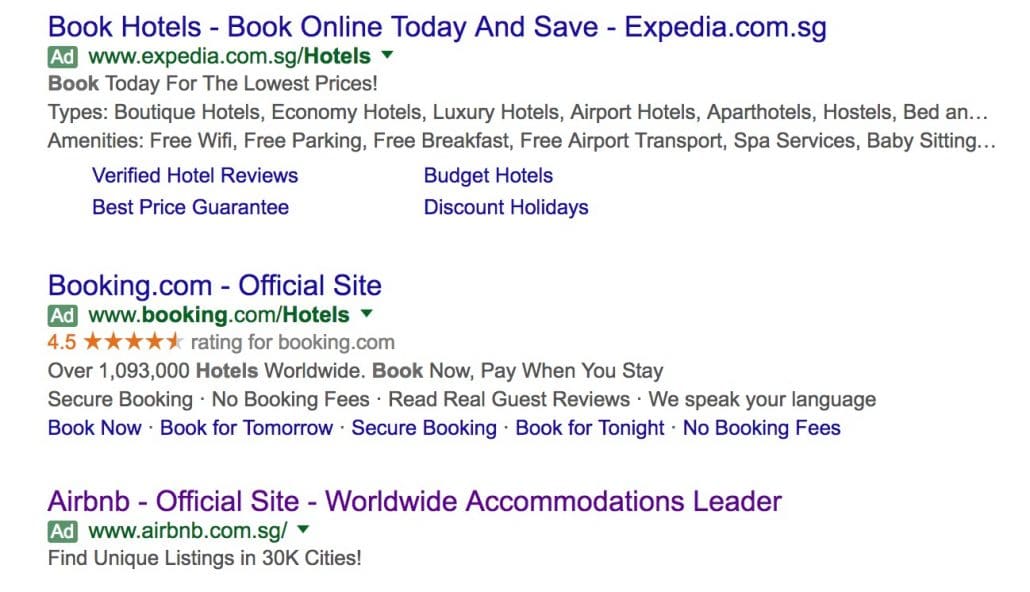
Doing a search on “book hotels” brings you these 3 top contenders – Expedia, Booking.com and Airbnb. These ads show up for all sorts of related terms relating to accommodations.
Therefore the next time a consumer is planning on going on a trip, he or she might recall anyone of these brands and do a brand name search instead (i.e. type in “Expedia” instead book hotels).
And don’t forgot to include your brand logo on your display ads!
Include Your Target Keywords (Text Ads)
As recommended by Google AdWords, include at least one of your target keywords in your ad copy.
This will help improve your quality score and also make your ad look more relevant to the searcher’s query.
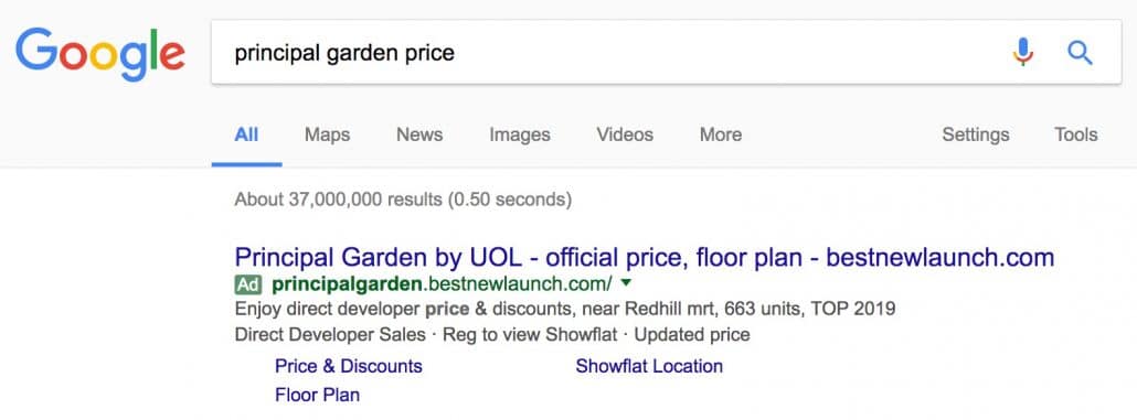
For example, if you targeted the keyword “principal garden price”, make sure you include the keywords in your ad text.
Limit Your Text (Display Ads)
Certain advertising platforms like Facebook Ads and Instagram (owned by Facebook) restrict the amount of words on your image. I.e. text can only make up 20% of your display ad.
Nevertheless, be conscious of the number of words you use on your display ad. Too many words can overwhelm viewers and distract them from the main message.
Use Relevant, High Quality Graphics/Images (Display Ads)
Using relevant images can garner more viewer attention to your ads. On the other hand, irrelevant images can confuse prospects and lose ad clicks.
Avoid overly complicated images that distract viewers from the main focus. Use images that have a clear focal point.
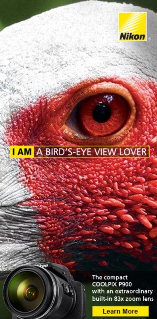
Check out this high quality ad by Nikon with its focal point on the bird’s eye, drawing viewer attention right the centre of the ad.
It’s also alright if you don’t include an image, as long as there’s a focal point in your ad that conveys your main message. Such as this ad by Hotels.com prompting viewers to sign in to unlock secret prices.
Use Good Colour Contrasts (Display Ads)
Good contrasting colours can make important elements more outstanding and convey the main ad message to the viewer.
This ad by Universal Studios uses only 2 different colours (apart from its logo) – White and Blue.
Reading the white words on the blue background is rather soothing to the eyes.
A/B Test Your Ads
Last but not least, always be testing.
You might think you’ve just created the best thing since slice bread. But you’ll never know for sure which ad will get you more clicks and conversions till you run multiple versions and analyse the results.
Recommended reading:
The Practical Science of A/B Testing your AdWords [Beginners Guide] – Wishpond
Conclusion
I hope you found these 21 best practices useful when creating your next ad creative. And here’s a checklist for that too.
A last word of caution for next time when you launch an ad campaign. Beware of ad fatigue. Ad fatigue is when your viewers get tired of seeing your ad over and over again that they either ignore it completely or report it.
Be sure to change your ad from time to time (there isn’t a fixed period) if you start to notice signs of ad fatigue (e.g. drops in click-through-rates).
If you’d like a much more comprehensive look into digital advertising, we offer a Digital Advertising Course. Feel free to also browse our wide array of digital marketing courses taught in-person in Singapore or online.
Dylan Sun is the Founder of Equinet Academy, a SkillsFuture Singapore WSQ-Accredited Digital Marketing training organisation. Passionate in all aspects of Digital Marketing and SEO, he extends his passion to helping people implement effective digital strategies to their businesses. Follow his blog at Equinet Academy to learn more about Digital Marketing.

