130+ Best LinkedIn Ad Examples
Not sure what ads to run on Linkedin? Check out these 130+ inspiring ad examples.
As you go through this article, you will:
- Get a clear overview of what’s working on Linkedin
- Acquire new ideas for your Linkedin ads
- See killer creatives and copies from top brands
This is the fastest way to learn about the best practices for Linkedin ads – By looking at top performing Linkedin ads.

How to see your competitor ads
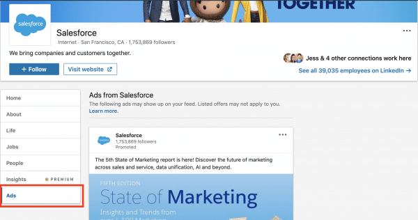
Before we dive into main course of juicy ads, i have to share this other little-known hack. In an effort to create more ad transparency, you are able to see what ads your competitors are running via the Ad Tab.
Out of every 5 B2B marketer i speak to, only 1 of them know about this (estimated). So if you read and remember this, you’re already smarter than 80% of all B2B marketers.
While pulling these top performing ads, i noticed that most of the ads have these in common.
Their intro text and headlines are usually short and concise
The offer is very clear. People know exactly what action they need to take and what they will get after the click
Most of the ads contain action verbs. For example: Download, Read, See, Build, Choose, Accept, Drive traffic etc.
Use questions or quotes in your ads.
Focus on the audience. Use words like “You”
Put an interesting fact or statistic
Position your offer as educational and helpful. Advice and insights works well on Linkedin as most users are on Linkedin to learn
Calling out your audience clearly in the ad.
Save it and use it as a reference whenever you’re planning to run ads on Linkedin.
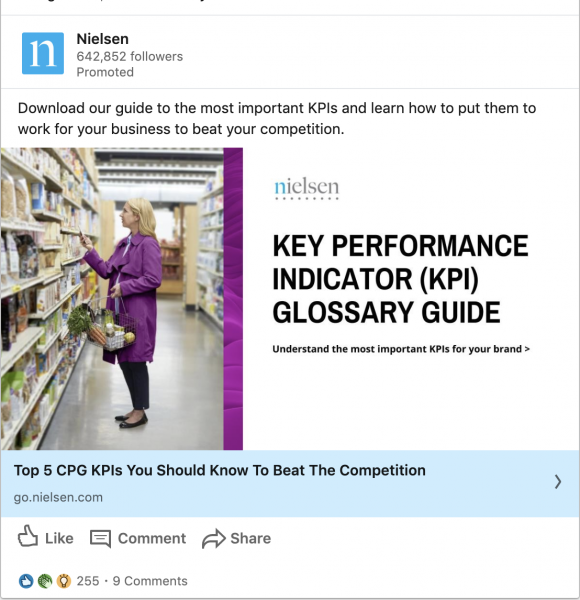
#1 – Nielsen
What stands-out in this ad?
Clear value through a guide. The offer is enticing. Who wouldn’t want to know how to beat their competitors? I’m sure any smart professional would want to know what their competitors don’t.
#2 – McClean & Company
What stands-out in this ad?
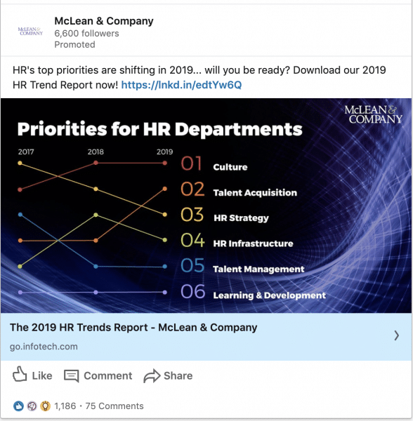
The creative itself show a snapshot of what they can read about. Entices audiences to want to learn more. At the same time, they also do a good job calling out their audience. It’s clear they are targeting HR professionals.
#3 – Salesforce
What stands-out in this ad?
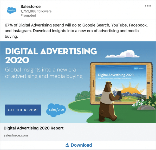
Using specific statistics and numbers usually grabs someone’s attention. Using the date “2020” also shows that this ad is most updated. CTA like “Get The Report” is clear.
#4 – Salesforce
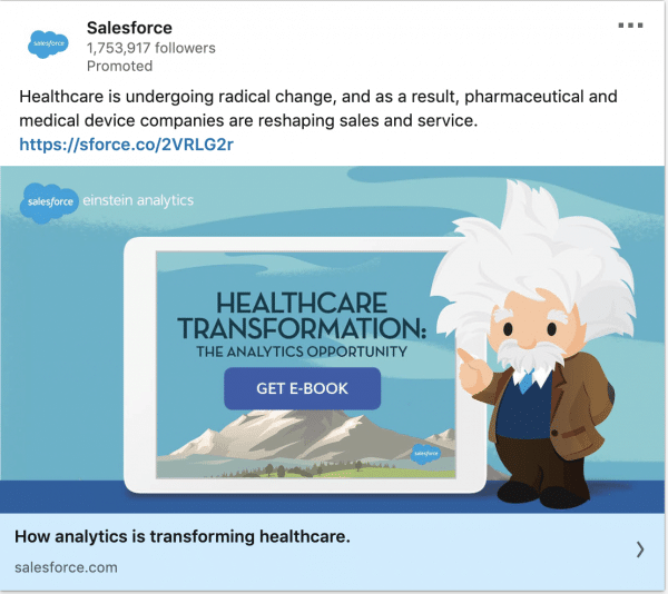
What stands-out in this ad?
You can call out your audience by industry as well, not just job functions and titles. In this case, the call-out is the Healthcare industry. Did you notice a rather similar theme between both salesforce ads? This is brand consistency at it’s best.
#5 – Microsoft
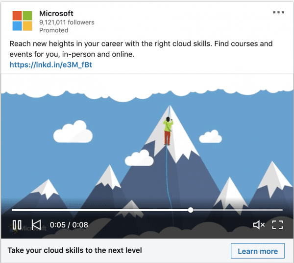
What stands-out in this ad?
Engaging video that relates to professionals trying to take their skills to “new heights” (Pun intended). Video is short, concise and the offer is clear – Taking your cloud skills to the next level.
#6 – Microsoft
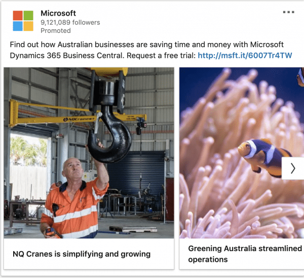
What stands-out in this ad?
SUPERB call-out of audiences. It’s clear this is for Australian businesses. The offer is also clear, which is a free trial to microsoft dynamics 365. The benefits are clear too where they can save time and money. What also stands-out is how they use each carousel card to feature a customer stories. This is a 5-star ad. Awesome!
#7 – WeWork
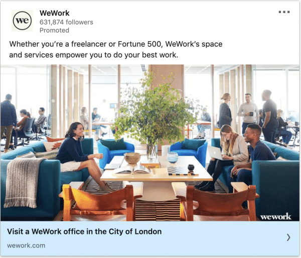
What stands-out in this ad?
Call out of audience is clear. A snapshot of the WeWork experience is captured in the creative.
#8 – WeWork
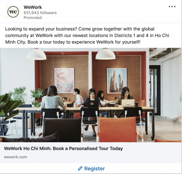
What stands-out in this ad?
The office locations are obvious. If you were looking at a similar area for an office, that’s going to capture your attention. Clear CTA – “Book a personalised tour today”.
#9 – WeWork
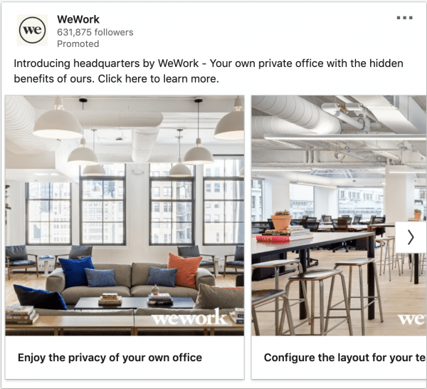
What stands-out in this ad?
Using the carousel cards to showcase different areas of the beautiful office is smart. If you have a product / service, you can break them up those way. Allow your audience to be immersed in your product/brand.
#10 – Workday
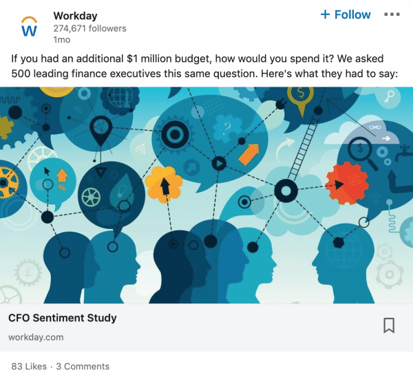
What stands-out in this ad?
Workday started with a provoking question. Then they provided the answer, but not just any answer. They provided a socially validated answer (By 500 leading CFOs). The headline is clear what audience will get, which is the CFO sentiment study.
#11 – Confluent
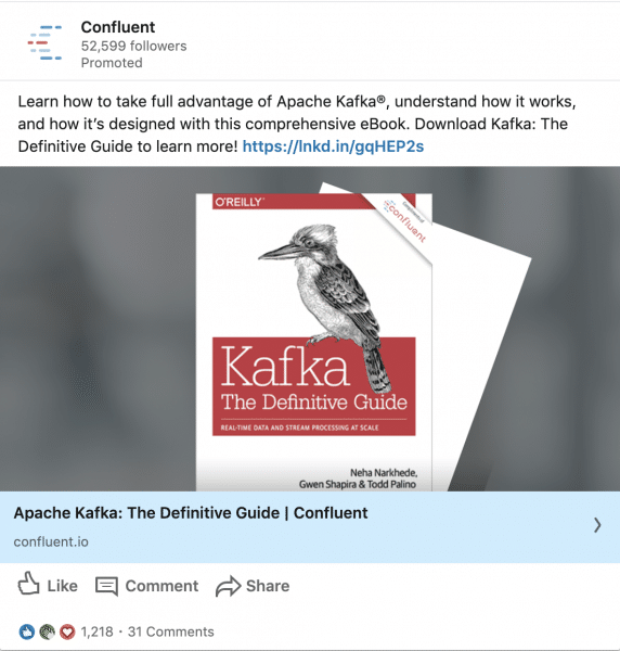
What stands-out in this ad?
Good audience call-out. Anyone who isn’t interested in Apache Kafka is not going to click this and waste their money. The creative also makes it clear that it’s an eBook. However, i would test a shorter intro text to avoid mobile truncation.
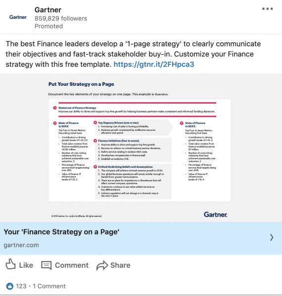
#12 – Gartner
What stands-out in this ad?
When i first saw this ad, i thought it was going to suck because the fonts on the creative is so small. But i was wrong. They called out their audience well and fed a quick-win offer (1-page templates). Perhaps making the creative small increases the curiosity of their audience. This is definitely a high-risk ad but something you can test. Reduce the size of your creative if it contains technical knowledge or flowcharts.
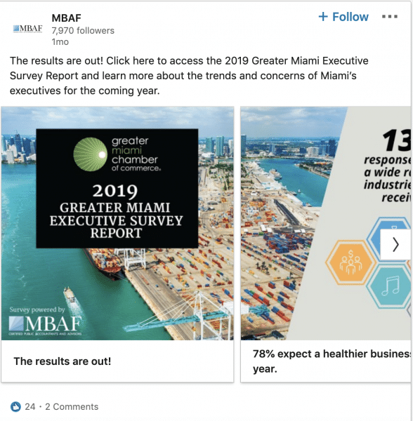
#13 – MBAF
What stands-out in this ad?
Trends and concerns of Miami’s executives? If you’re in Miami and you’re an executive yourself, i’m pretty sure you’re going to be interested. Great use of carousel ads to showcase an interesting stat in each card.
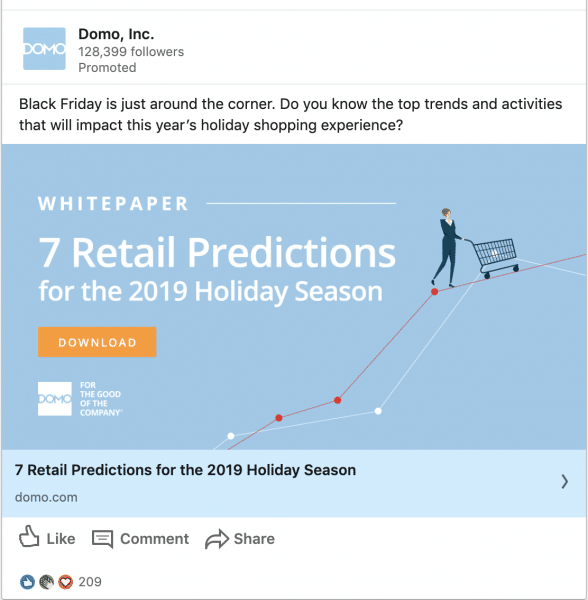
#14 – DOMO
What stands-out in this ad?
This ad follows the holiday season and satisfies their audience’s curiosity. If you’re in retail, projections and predictions in the retail industry would be of interest. The ad also contains a challenger message. A question was asked to challenge the audience’s knowledge.
#15 – Simplilearn

What stands-out in this ad?
I love the way they called out the country and shared the potential gains from their product. They dropped an interesting statistic as well. The creative also breaks down what they course contains. Take note that Linkedin does not have a text limit on the creatives like Facebook does.
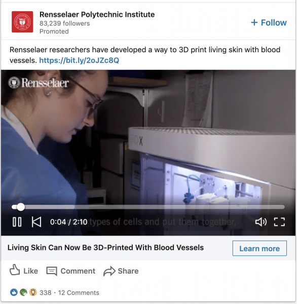
#16 – Rensselaer Polytechnic Institute
What stands-out in this ad?
They showcased the outcome of their course. The game-changing result of going through a Rensselaer program. They did it in video format as well which stands out if your competitors are rarely doing it.
#17 – Smith School of Business at Queen’s University
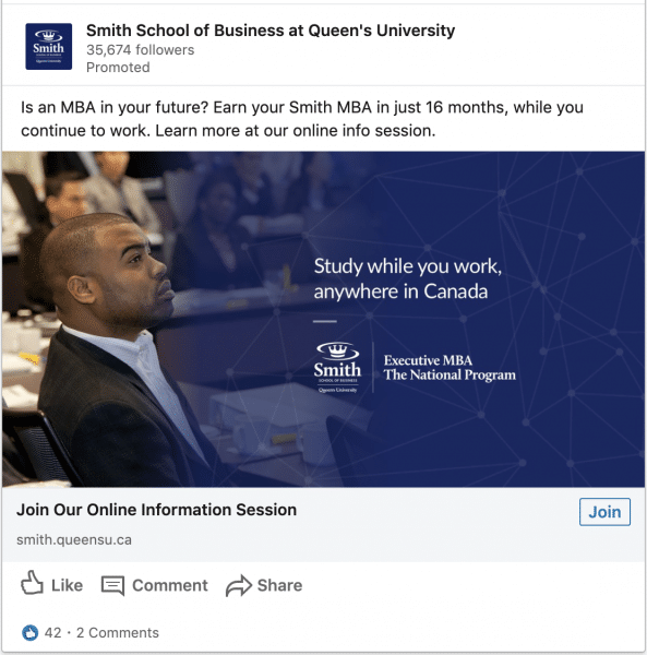
What stands-out in this ad?
Benefits are clear. Love how they clearly state how long their program is. Although the intro text is more of a “feature”, they have clearly painted the “benefits” in the creative itself.
#18 – Citrix
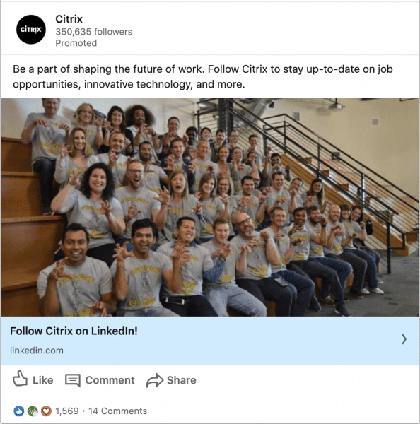
What stands-out in this ad?
Great engagement ad. Brings out the human side of the brand. It doesn’t have to be serious all the time. Emotions like humour plays an important role in B2B marketing too.
#19 – Glassdoor for employers
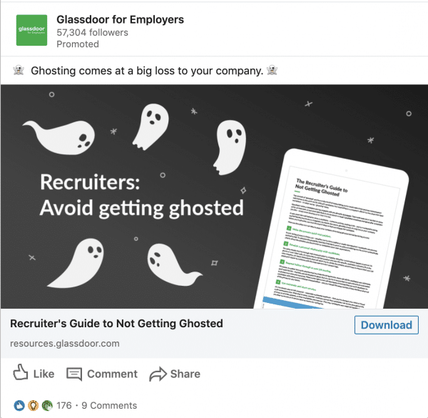
What stands-out in this ad?
Image is unusual which catches attention. Their use of emoji is also not common on Linkedin which makes the ad stands-out more. The headline is clear about what the offer is – Which is a Recruiter’s guide.
#20 – Outreach
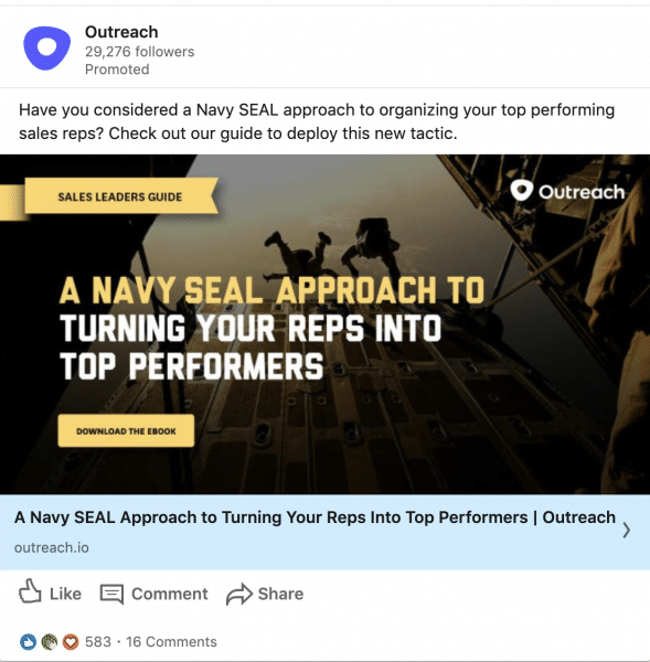
What stands-out in this ad?
Good call out of audiences. It’s obvious that they are targeting sales professionals. Any ads that directly helps companies make more money usually works well.
#21 – Aha!
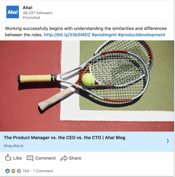
What stands-out in this ad?
This is a great awareness piece. Sometimes it’s not just about lead generation. Smart marketers usually warm up their audiences with valuable ungated content. The call-out of audience is also obvious in the headline. The creative could be more customised though. More testing is needed on the creatives.
#22 – Ivey Business School at Western University
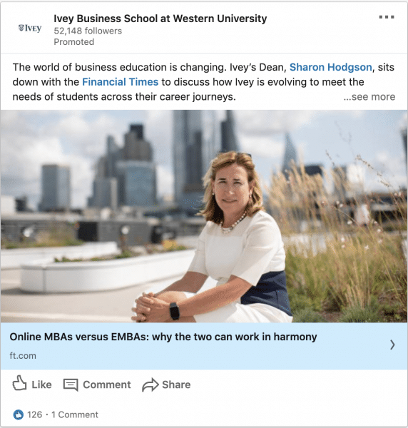
What stands-out in this ad?
Interesting use of tagging. The article is also a third-party content which gives them more credibility. Using a human image also stands-out. This works great as an awareness piece but would probably under-perform for lead generation
Loving the ad examples? You can download them for your reference here!
#23 – Qualtrics
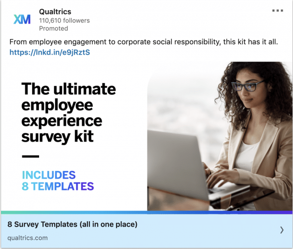
What stands-out in this ad?
Massive value here! They’re giving away templates that can immediately be plugged and played into employee experience teams. Qualtrics makes it very easy for audiences to find value.
#24 – Airbnb for Business
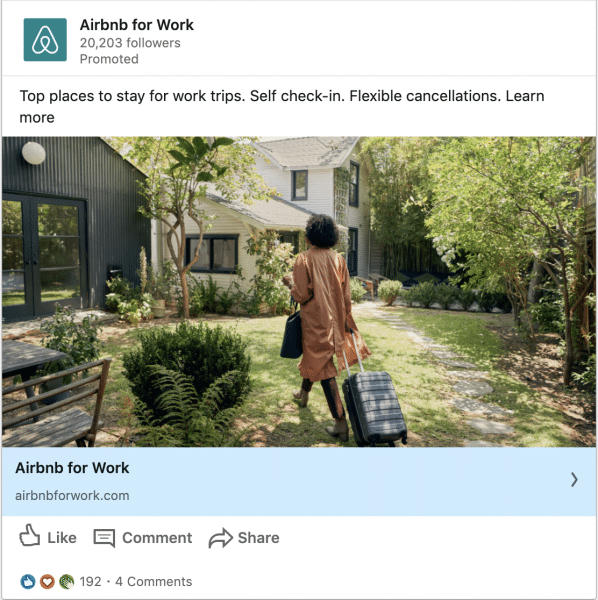
What stands-out in this ad?
Great ad that speaks to travelling employees. They could have created a more branded image. Just by looking at the image/creative, audiences must be able to tell that it’s an Airbnb ad.
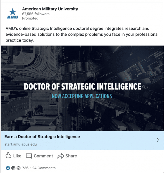
#25 – American Military University
#26 – Taking the GRE
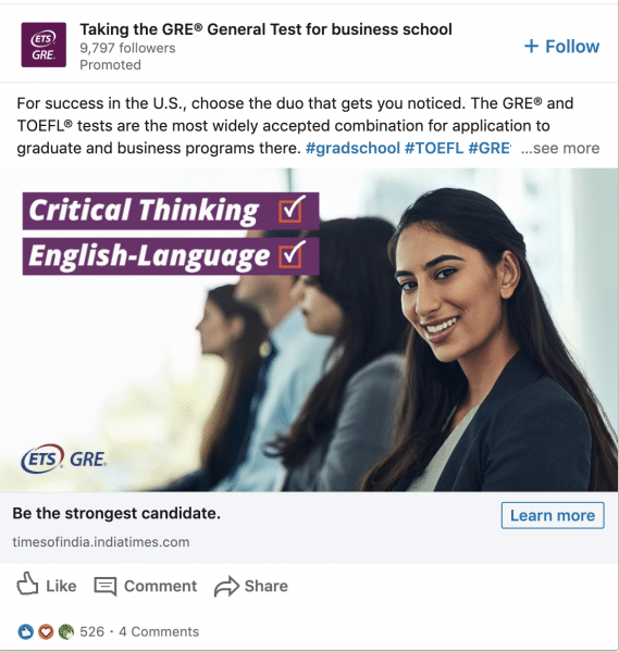
What stands-out in this ad?
Using Asian faces for Asian countries helps. This would probably do well as an awareness/consideration piece and not for lead generation
#27 – Fonolo
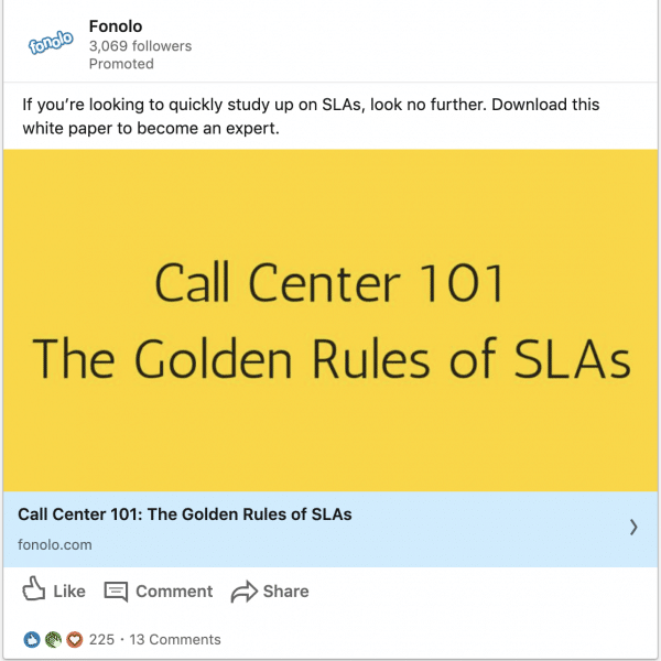
What stands-out in this ad?
Thought leadership. This is a great piece to show that they to solve the customer’s pain points. The call to action is clear in the intro text but could have added another in the headline or creative itself. They also used industry terms like “SLA” so only audiences who understands this would click on the ad.
#28 – Qualtrics
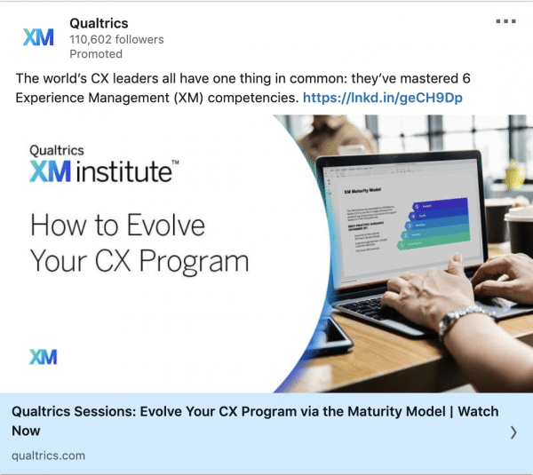
What stands-out in this ad?
Using “How to” presents a very actionable resource. The audience is also obvious. There’s a pinch of FOMO in the ad where they mention that CX leaders have “one thing in common”. If you’re a CX leader, you would want to know whether you have that X factor too or whether you’re missing out. Notice how all of Qualtrics’s ads also look rather similar. Great brand consistency.
#29 – Gong.io
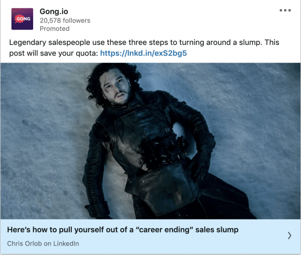
What stands-out in this ad?
Absolutely love how Gong.io uses popular culture to relate that to their customers’ struggles. This is the scene where Jon Snow dies and Gong.io ties it back to a “sales slump”. Definitely an ad that stands out. This would make a great awareness piece and to show their thought leadership.
#30 – Gong.io
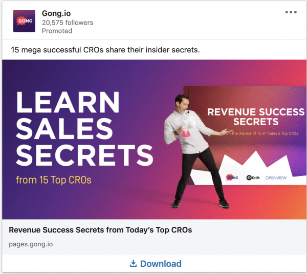
What stands-out in this ad?
I’m going on a rampage with Gong.io ads. Look at this phenomenal piece. If you’re a sales person, wouldn’t you want to know what sales tactics the top 15 CROs are using? They were also very specific in the number of CROs. Specificity increases likelihood of capturing attention. There are brands logos in the ad as well to show where some of the CROs are from. This builds up massive curiosity about what the CROs of growing brands are saying about sales.
#31 – Gong.io
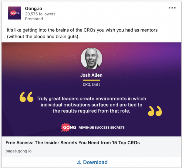
What stands-out in this ad?
My bet is that this is an a/b test of creatives between the #30 and #31 ad. It’s the exact same offer but this time they focus on one CRO as social proof. They also used the word “Free”. Although that’s overused in direct-response marketing, it still works. An all-rounded great lead generation piece.
#32 – Gong.io
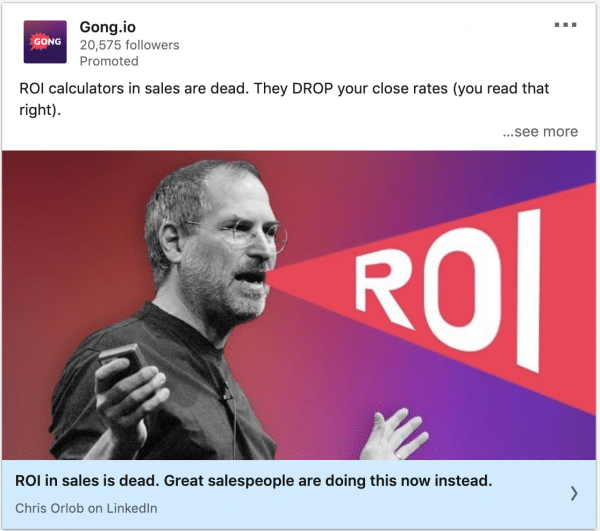
What stands-out in this ad?
Another great awareness piece by Gong.io. They started with something provoking and built curiosity about what the new best practices are. If you want to be left behind with outdated sales practices, you’re probably going to click on this.
#33 – Tableau
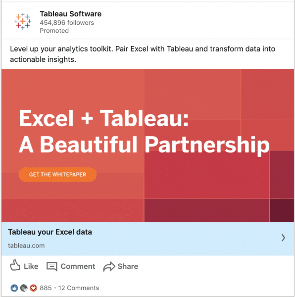
What stands-out in this ad?
The bright colours and text only ad makes this unique. Remember that Linkedin does not have a text limit on creatives like Facebook does. If you’re a marketer with partnerships with other companies, ads like this would be best for you. Although the call to action is clear with “get the whitepaper” they could have done better by saying what’s in the whitepaper. Is it a tutorial? Is it a set-up guide? Overall, this is still brilliant.
#34 – NetBrain
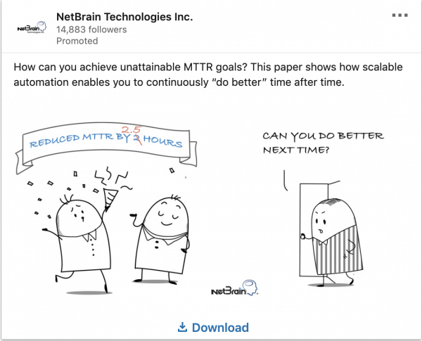
What stands-out in this ad?
Illustrations, graphs and flowcharts does extremely well on Linkedin due to it’s informational environment. This ad by NetBrain brings in humour and illustration at the same time. The creative is self-explanatory and reflects the mindset of their audience.
#35 – NetBrain
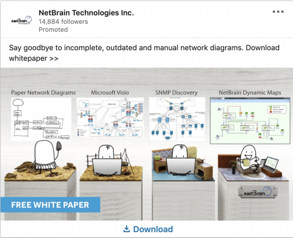
What stands-out in this ad?
NetBrain takes it up one level to show the “before and after” through a well designed illustration. A very clear story of the daily struggles of their audiences and what overcoming it looks like.
#36 – TMI – Wharton Programs
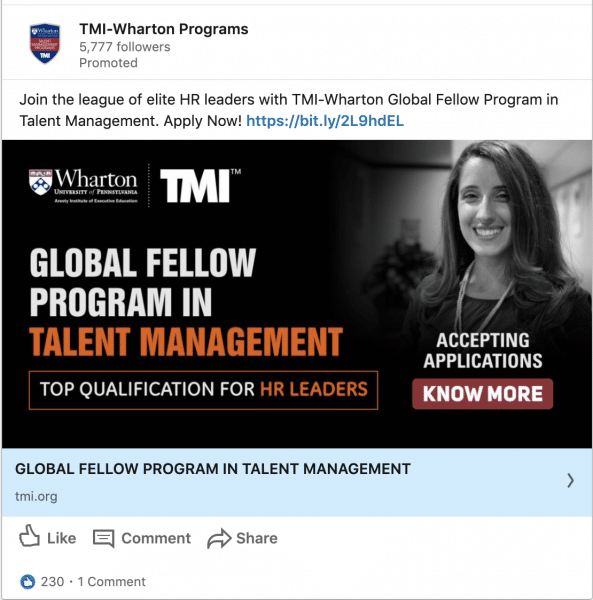
What stands-out in this ad?
The shout-out to their audience is extremely clear here. I love the way they phrase this ad. They make it seem like this program is for HR leaders who wants to be part of the “elites”. Who wouldn’t want to be part of that tribe? Call to action is also clear in the creative.
#37 – Pendo
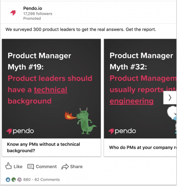
What stands-out in this ad?
The horribly designed creatives stood out. It’s unrefined that it just stops you. However, as you read, you realise that there is a ton of value here. It’s original research data about product managers. They used the carousel card to showcase what’s in the report to build curiosity. Look at the level of engagement in the Likes and Comments section. Pendo was not afraid to provoke and spark discussions.
#38 – Insidesales.com
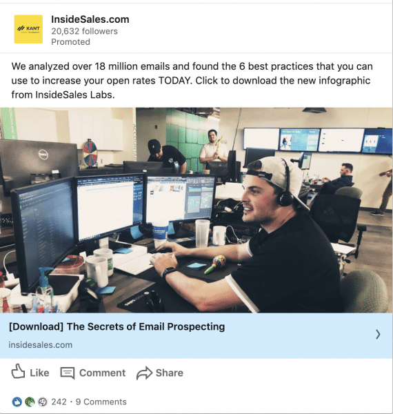
What stands-out in this ad?
Wow, they analysed 18 million emails and consolidated 6 key findings for sales people! That’s a ton of data point that most sales individuals do not have. Insidesales.com was direct on what the offer was, what the outcome was and what they wanted their audience to do with the ad. The image is also authentic showing a salesperson at work (This is based on my own interpretation).
#39 – Duke University
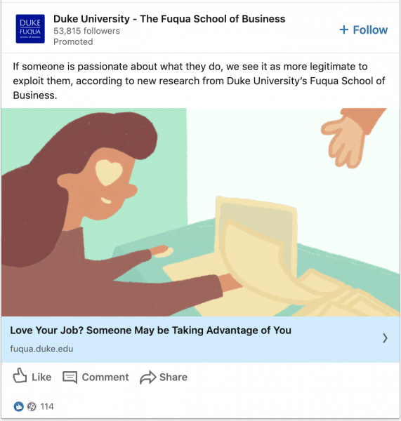
What stands-out in this ad?
The headline stood out for me. Nobody wants to be taken advantage of. So i can imagine most would stop to read the intro text after or click-through to find out more.
#40 – Think with Google
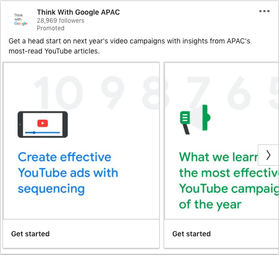
What stands-out in this ad?
Great use of the carousel cards. Each card specified a benefit. The intro text also mentioned what they’re going to get after the click. Insights from APAC’s most-read youtube articles? Count me in! 🙂
#41 – Think with Google
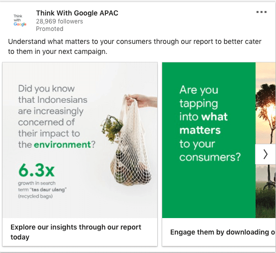
What stands-out in this ad?
Google has tons of data and they use these insights to their advantage. They added value and insights to their audience through a report. This establishes them as the thought leader and go-to service/product. Think with Google featured each unique insight on a carousel cards which is examplerary.
#42 – On24
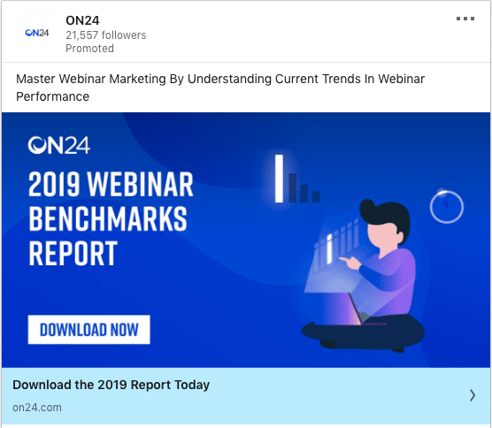
What stands-out in this ad?
Trends works well on Linkedin. People come to Linkedin to learn where the industry is going, what their peers are up to and how they can improve themselves. So this ON24 ad is sure to stand-out if you were interested in Webinars. Most professionals use benchmarking as a point of reference to make various business decisions. So it’s no surprise this report was a hit.
#43 – On24
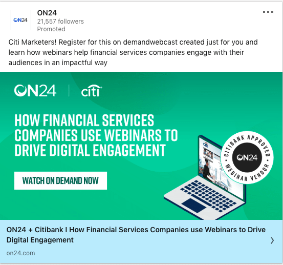
What stands-out in this ad?
This is industry Personlisation at it’s best. They call-out the industry and also name-dropped a big brand for social proof.
#44 – On24
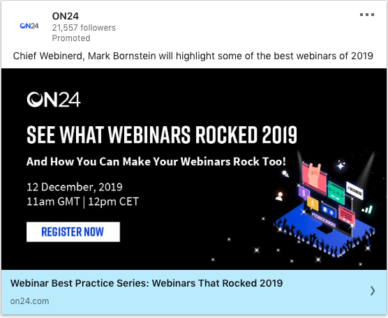
What stands-out in this ad?
Great ad that compiles their unique insights into Webinars that worked! Linkedin users want to know what’s working and replicate similar successes to themselves. It’s the exact same reason why you’re attracted to this article.
#45 – Atlassian
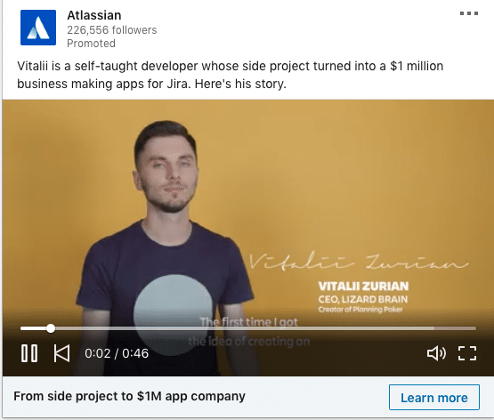
What stands-out in this ad?
Customer stories that brings out the emotion and social proof always works. It shows what Atlassian provides and the positive outcome they could bring.
#46 – Atlassian
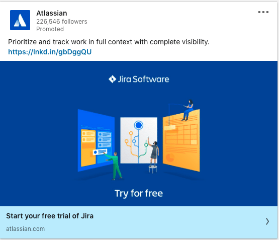
What stands-out in this ad?
Lots of action words in the intro text. Try it free is the icing on the cake.
#47 – Quip
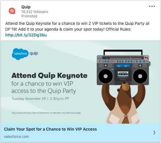
What stands-out in this ad?
This is a great example to tie in your offline marketing with your online efforts. In this example, Quip launches an ad to get prospects to reserve a spot at their Dreamforce event.
#48 – Quip
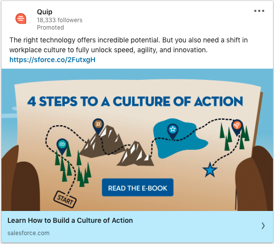
What stands-out in this ad?
The creative is well designed and has a strong call to action.
#49 – AT&T
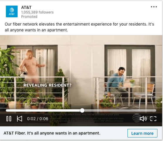
What stands-out in this ad?
Humour is one of the most effective ways to leave a lasting impression on your brand. In this ad, AT&T does an engaging funny video while building awareness to their fiber network. It’s interesting to see how Linkedin is evolving beyond B2B and into B2C.
#50 – Marketo
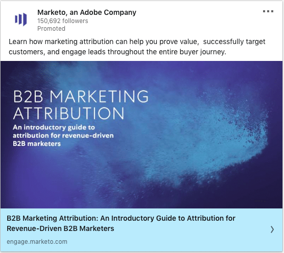
What stands-out in this ad?
The colour somehow seems so magnetic. The creative brings out the offer really well. This kind of thought leadership and educating content fits well in Linkedin where users are there to learn from brands/experts. Who do you think they will think about when they’re looking to purchase a Marketing attribution software? Most likely the brand that added the most value to them, which in this case is Marketo. The one thing i would change is shortening the headline.
#51 – Marketo
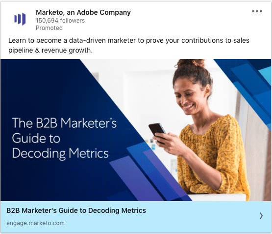
What stands-out in this ad?
Marketo does these thought leadership pieces really well. It hits on marketing professional’s aspiration to be “data-driven”.
#52 – Marketo
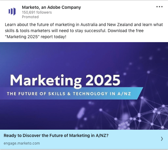
What stands-out in this ad?
This made it to the list because of the personalization to Australia and New Zealand. Linkedin is especially a great place to promote pieces that talks about trends in skills/tech. It’s a sure-hit topic.
#53 – LandBot.io
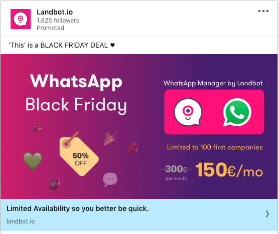
What stands-out in this ad?
LandBot does well in connecting their offer to a festive season/event. This is a straight forward to-your-face offer.
#54 – LandBot.io
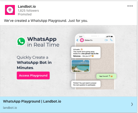
What stands-out in this ad?
This 2nd variation from LandBot shows a snapshot of how their product works. The text on the creative is also clear what audiences can expect when they click through. If you’re someone who wants to try a WhatsApp bot, this is for you. They even mention how easy it is for you to try it now.
#55 – QualComm
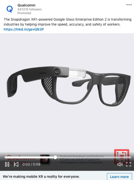
What stands-out in this ad?
This is one of my favourite! They showcase the impact of their technology through tangible products. What most important here is that they’re using a 1:1 video which looks absolutely huge on the Linkedin newsfeed. Not enough advertisers are using 1:1 videos. Your ad will stand-out if you do.
#56 – Fonolo
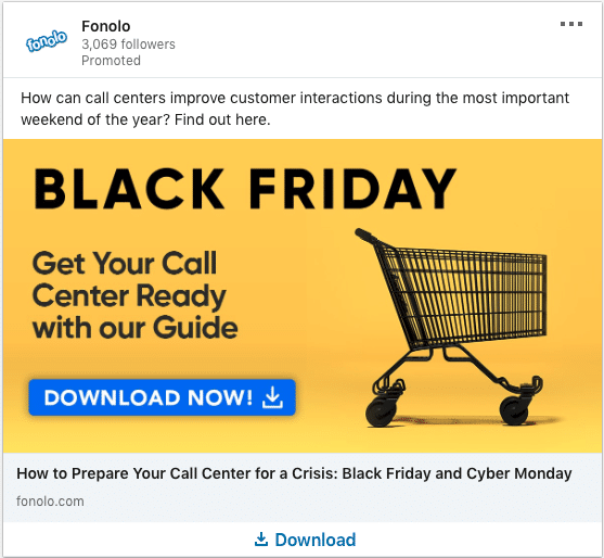
What stands-out in this ad?
Smart ad by Fonolo that ties in their expertise with various important dates. There is some sense of urgency in this offer as you need to prepare for the upcoming events like Black friday. The 2 call to action is clear what Fonolo wants their audience to do.
#57 – Sensera Systems
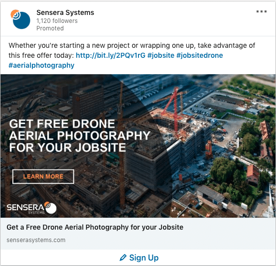
What stands-out in this ad?
A very unique offer. Most ads on Linkedin are not creative. The “art” in marketing is underappreciated as most marketers just focus on short-term goals like direct-response cheesey ads. I would exclude the hashtags as it might distract audience from taking the one action Sensera wants which is the sign-up.
#58 – Sensera Systems

What stands-out in this ad?
People are attracted to stories. Showcasing your customer’s story is a smart move on Linkedin. This builds up awareness and trust in your brand.
#59 – Robin
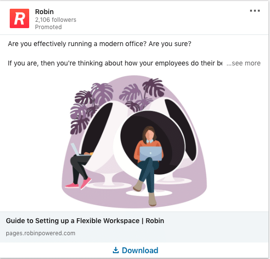
What stands-out in this ad?
Isometric designs are the cool thing these days. Other than design, they asked a question that helps qualify their audience. This helps ensure that they get higher quality audience clicking and not random users (of course ad targeting plays a part too). It’s clear what this guide can help you with.
#60 – Robin
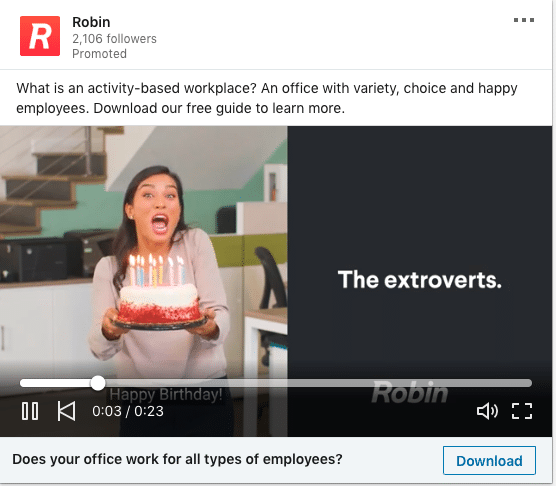
What stands-out in this ad?
Stellar use of Humour. Linkedin doesn’t have to be serious all the time. If you can relate to your audience’s pain points in humourous ways, you should do it. Making this ad into a video gets extra points!
#61 – Adobe Creative Cloud
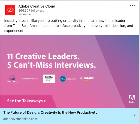
What stands-out in this ad?
Look at that background gradient colour. That pinkish purple gradients will really pop and capture attention on Linkedin. Did you notice how they name-drop top brands? Association and brand validation is a big thing on Linkedin and you should do it too. See how they place the logos on the ad creative. The only thing i might change is to create larger sized logos.
#62 – Adobe Creative Cloud
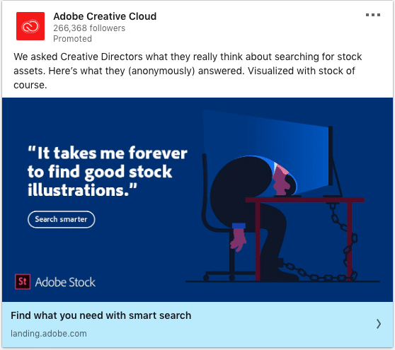
What stands-out in this ad?
Boom! Using a quote of your audience pain point is always going to be a hit. The intro text also clarified the audience that this quote came from – Creative directors. If you’re a creative director, this is going to hit you in the gut.
#63 – Dataminr
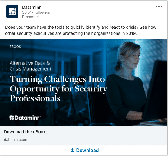
What stands-out in this ad?
A good direct-response ad. They call out their audiences within the creative itself and the headline states exactly what they will get if they submitted their info.
#64 – Dataminr
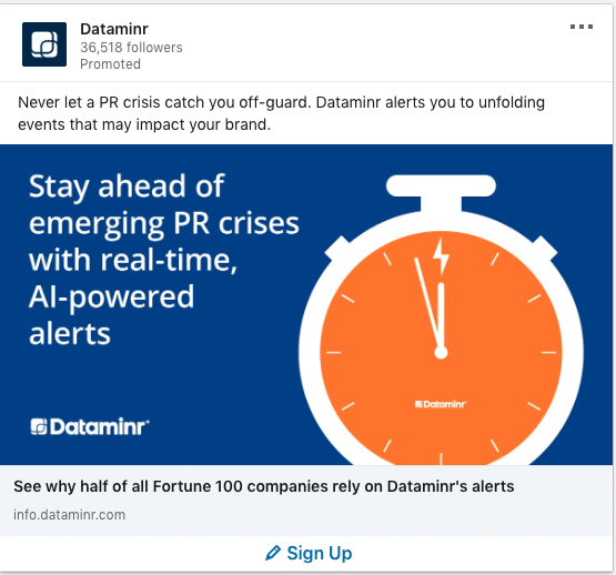
What stands-out in this ad?
I love how they showed brand validation in the headline by stating that Fortune 100 companies use them. This makes a great awareness ad to introduce what Dataminr is solving for. But i wouldn’t use this as a lead generation ad because there isn’t enough value to your audience to “sign-up” yet (Well, not unless this is a retargeting ad to warm audiences).
#65 – Dataminr
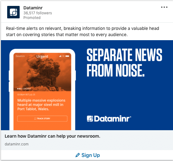
What stands-out in this ad?
The bomb in the image will definitely stop the right audience from scrolling. This makes for a good brand awareness ad and not so much for lead generation though.
#66 – Amazon Web Services (AWS)
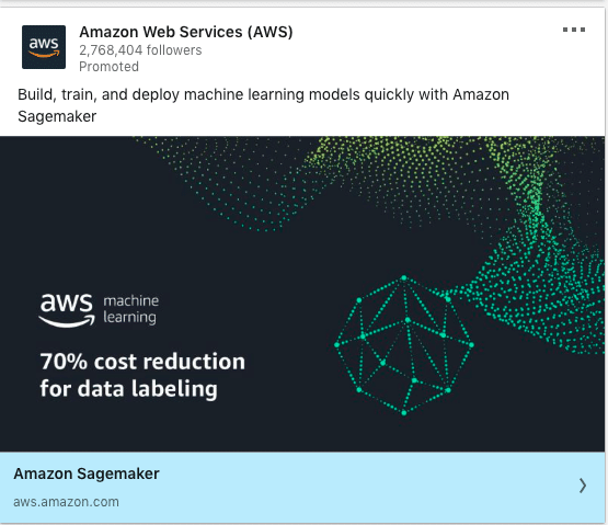
What stands-out in this ad?
Sometimes, you just need to straight out introduce what you do as a brand. In this ad, amazon does it very well and even has specific ROI claims.
#67 – Amazon Web Services (AWS)
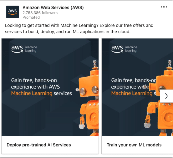
What stands-out in this ad?
This ad started off with a question which is great. They continued by showcasing all the free offers and services for their audience. Tons of value in the ad that is worth engaging in.
#68 – Zendesk
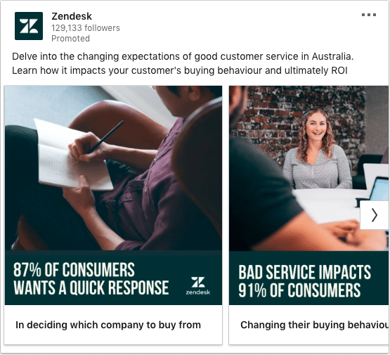
What stands-out in this ad?
Each carousel ad featured an insight. The intro text called out the country as well. Specificity gets more attention and engagement.
#69 – Zendesk
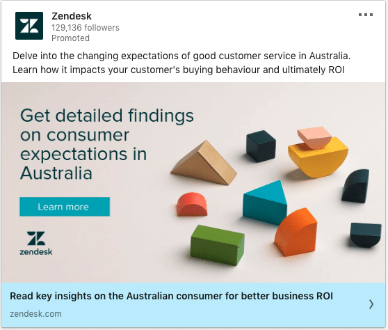
What stands-out in this ad?
The headline and copy in the creative is compelling. It speaks calls-out CX pros in Australia very clearly with a good offer. CTA button on the creative also helps.
#70 – Linkedin Marketing Solutions
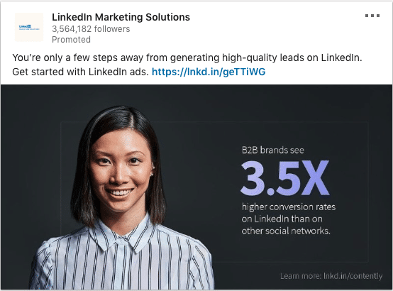
What stands-out in this ad?
The smiling human imagery draws attention. The creative design is also great. Big fonts with statistics separately on the right side makes the image pop.
#71 – Linkedin
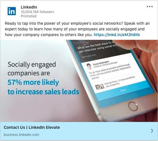
What stands-out in this ad?
Asking a question at the start draws the audience in. The copy on the creative is nicely placed on the left making the entire image pop.
#72 – Linkedin
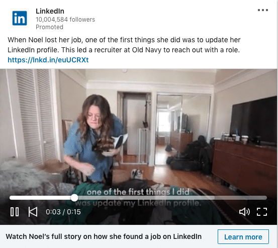
What stands-out in this ad?
Using a video to tell a story works. Who says B2B marketing is boring and emotionless. Zooming in on a single person, customer, user to tell their story is convincing.
#73 – Linkedin
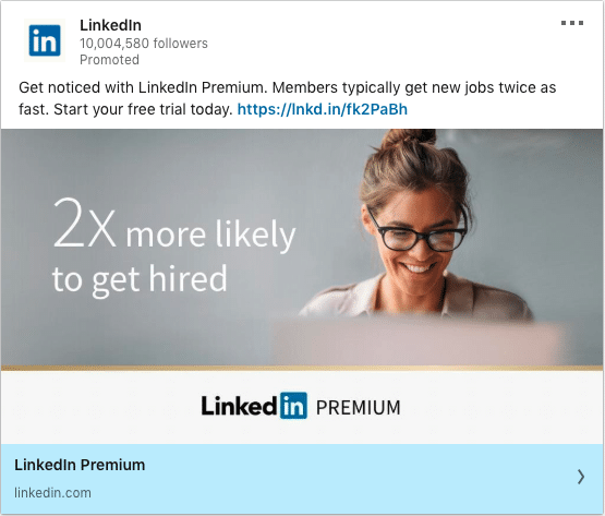
What stands-out in this ad?
Straight up offer that would be amazing for retargeting. The value proposition and benefit is clear: Get hired.
#74 – Deskera
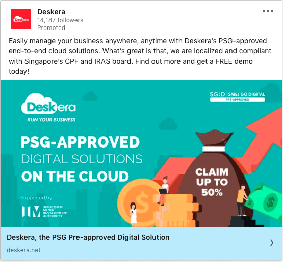
What stands-out in this ad?
If you have an offer that relates to grants, time-sensitivity and government regulations, make it clear. The ad above shows how Deskera’s technology can be claimed with a grant. I would reduce the length of the intro text to prevent mobile truncation.
#75 – VWO
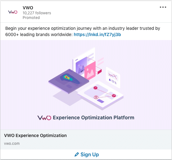
What stands-out in this ad?
The pink background and isometric design is unique. I like how they stated the number of brands who are working with them. Strong social proof. This would have either been a good awareness play or a retargeting play. If this was a lead gen play, it would have been costly as the offer wasn’t strong. It’s very product related with no clear “what’s in it for the user” message.
#76 – VWO
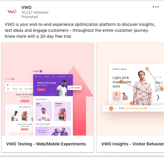
What stands-out in this ad?
VWO ads are visually appealing. This version is better than the previous one. At least there is an offer which is the 30-day free trial. There always need to be a value exchange in the ads. What’s in it for the user if they were to commit and try?
#77 – Tokopedia
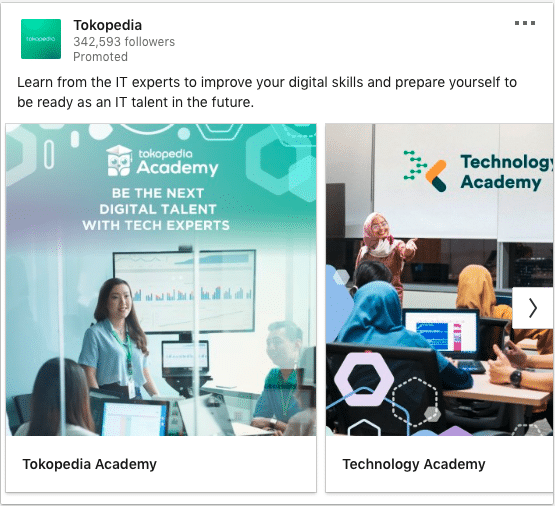
What stands-out in this ad?
Linkedin users are on the platform to learn new skills and trends from brands/experts. This offer from Tokopedia about skills upgrading is a natural fit. Since they’re on of the biggest tech brand in Indonesia, that makes this offer even more compelling.
#78 – Optimizely
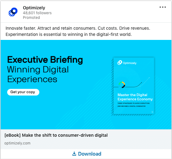
What stands-out in this ad?
There’s so many amazing practices here. The intro text is short, to the point and all about benefits. It’s a strong statement of benefits. Their headline and creative makes it clear what users are going to get if they click on “Download”
#79 – Optimizely
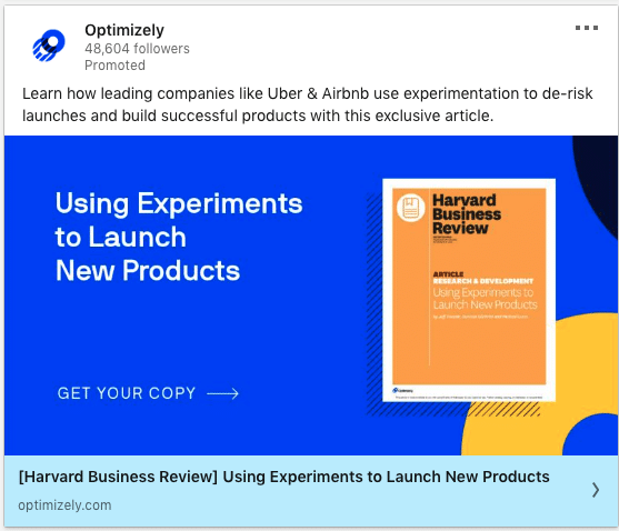
What stands-out in this ad?
I love how they use a rather similar template throughout their ads and just change the background colour to make it unique. Alot of namedropping all over the ad. You’ll notice big brands in the intro text and even in the headline.
#80 – Optimizely
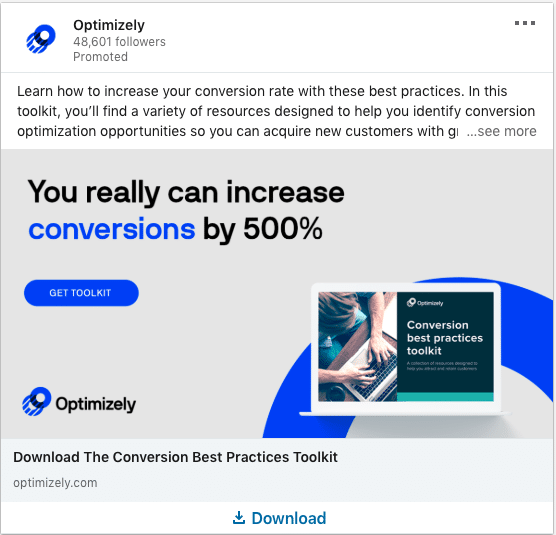
What stands-out in this ad?
Intro text could be shorter but this is overall still an amazing ad. The creative’s copy is absolutely clear with quantifiable results/numbers.
#81 – Optimizely
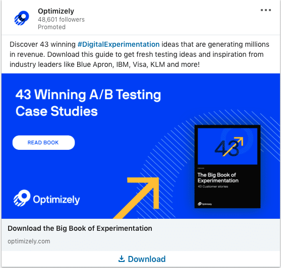
What stands-out in this ad?
Users love to read case studies, examples and learn from other’s experiences. Which is why you’re reading this long blog post of Linkedin ad examples right? The only thing i would change is testing a shorter intro text. There were a couple of namedrops but they were located at the end and might be truncated off on mobile.
#82 – App Annie
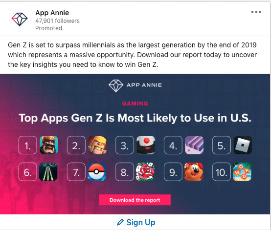
What stands-out in this ad?
This. Is. Kick-ass. When i saw this thumb-stopping ad, i literally had to pause and see if i recognized the logos here. This sparks so much curiosity especially if you’re interested in what Gen Z is engaging in. No-brainer to download this report. Intro text is also too long for this though.
#83 – App Annie
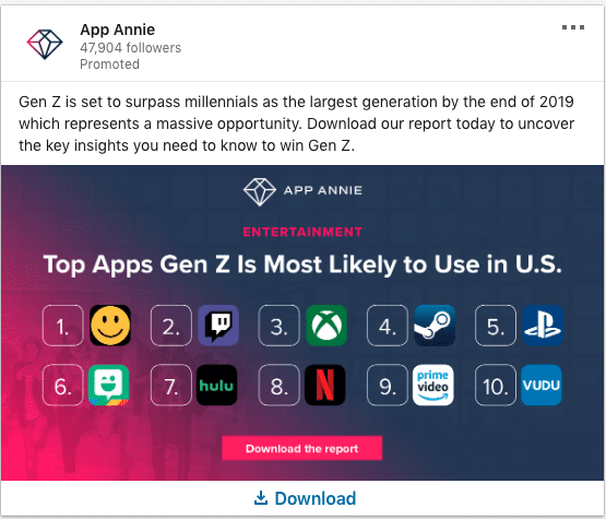
What stands-out in this ad?
Similar idea to the previous ad but this time they were targeting a different persona – Gen Z’s top Entertainment apps.
#84 – INSEAD
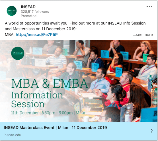
What What stands-out in this ad?
I like that the information is complete on this ad. There’s an event date and the session’s aim.
#85 – Spencer Stuart
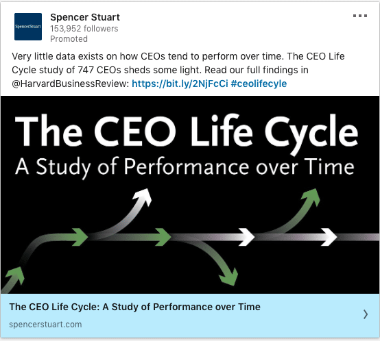
What stands-out in this ad?
Who doesn’t love an original research with fresh insights. What’s great is how specific they are about the ad. They even stated how many CEOs they had to interview to get this data. Notice anything else? They worked with HBR on this which makes it even more credible.
#86 – Center for Creative Leadership
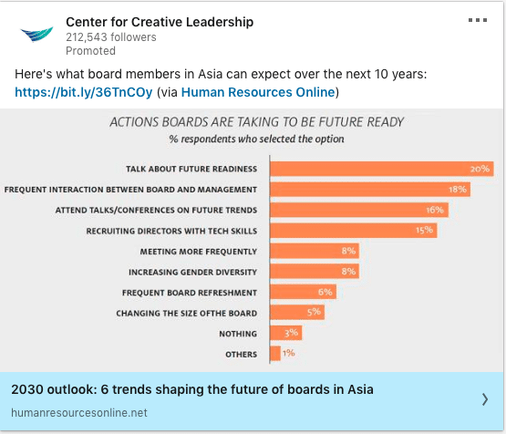
What stands-out in this ad?
Linkedin users tend to love graphs. If you showed this on Facebook, many are just going to scroll past because they’re not in the mindset to learn. People go to facebook to waste time and catch-up with friends. That’s why this works well. It educates a user and helps them in their career.
#87 – Backbase
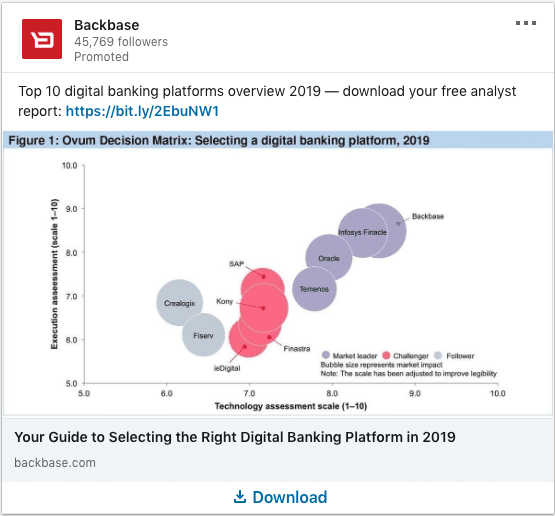
What stands-out in this ad?
Graphs, trends and statistics. If you have a compelling data point, bring it up front in your copy and creative. This buyer’s guide by Backbase totally nailed it. Audiences who are interested in these are going to want to know which are the top platforms.
#88 – Globoforce
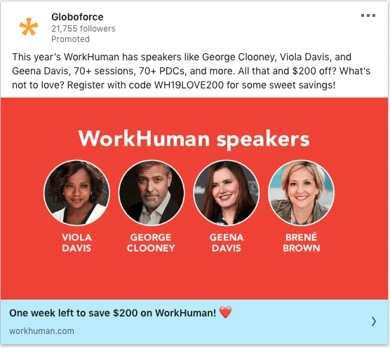
What stands-out in this ad?
They’ve got faces and big names on the creatives and a killer FOMO headline. The intro text is slightly too long but the copy is great! It tells us a little about what to expect at the event.
#89 – Department for Transport (GfT), United Kingdom
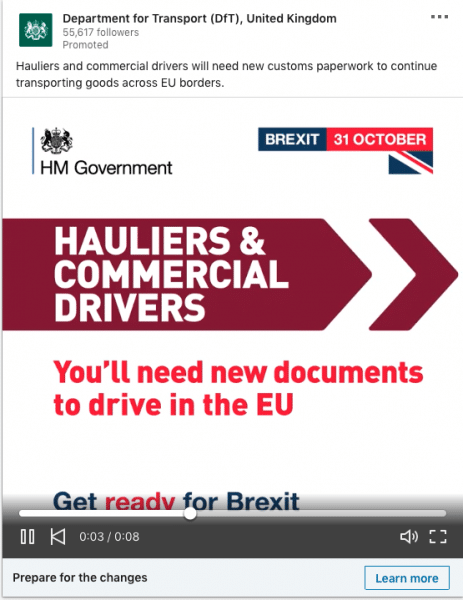
What stands-out in this ad?
Killer ad by government. They’re using a 1:1 video ratio which will appear big on a Linkedin user’s mobile phone. The message in the video contains a sense of urgency and it calls out their audiences really well.
#90 – PwC
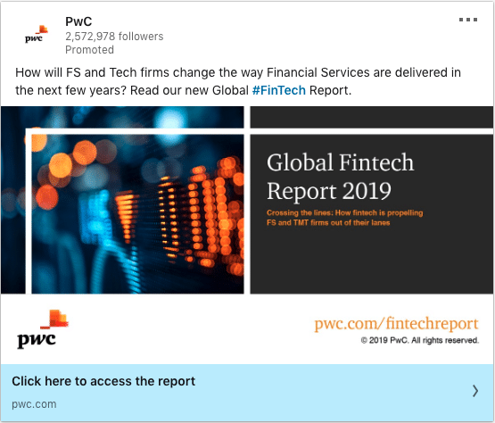
What stands-out in this ad?
Great start by asking a question to qualify their audience. The offer helps their audience become smarter and up-to-date, which is compelling enough for a click.
#91 – PwC
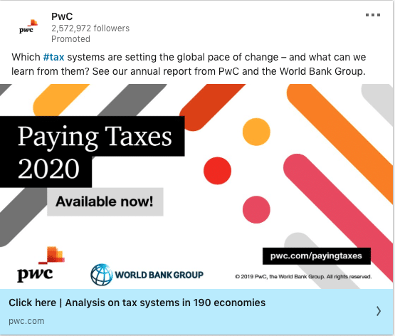
What stands-out in this ad?
PwC is clearly establishing itself as a thought leader. Similar to the previous ad, they aim to add value through knowledge and insights. Extra points to this ad for adding the “World Bank Group” logo which boosts the content’s credibility.
#92 – Snack Nation
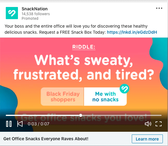
What stands-out in this ad?
We love this ad so much! I bet it was initially designed for instagram but they repurposed it for Linkedin. They used a video to ask a question and provided 2 multiple-choice answers. However, the main offer which is a “FREE Snack Box”, should have been more obvious. Perhaps adding it into the headline other than the intro text will help.
#93 – Snack Nation
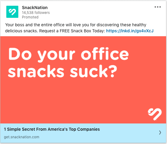
What stands-out in this ad?
Simple yet effective creative. Asking a question that provokes thought helps gain more attention. If the audience said “yes” in their minds, they would have clicked in.
#94 – Snack Nation
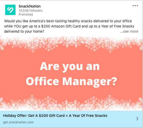
What stands-out in this ad?
Following a similar theme, they asked a question that is very relevant to their audience on Linkedin. Job function and job titles targeting is available on Linkedin. Also, the offer is also very clear.
#95 – The Wall Street Journal
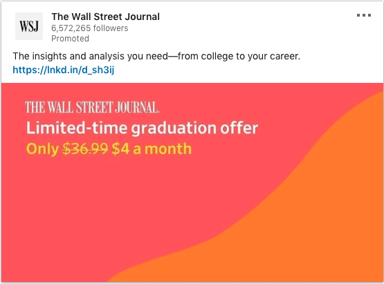
What stands-out in this ad?
The gradient colour just grabs your attention. The offer is also really clear on the copy. Did you notice how they called our their audience in the intro text? They’re targeting the new-comers into the workforce.
#96 – The Wall Street Journal
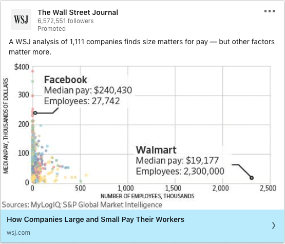
What stands-out in this ad?
This follows a “breaking news” kind of format and feel. The specificity in the ad and the sneak peek on the creative is very compelling. The headline is also provoking. Who wouldn’t want to know how whether their companies are paying them fairly compared to others.
#97 – The Wall Street Journal
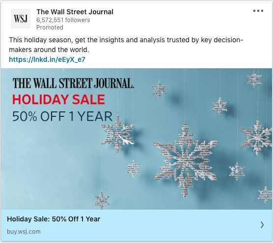
What stands-out in this ad?
Offer ties in with a theme and season. Perfect!
#98 – The Wall Street Journal
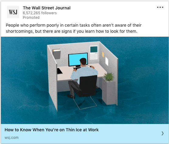
What stands-out in this ad?
“How to” practical articles works well on Linkedin. This ad is also very relevant to Linkedin users as most of them are professionals. Knowing whether their jobs are in danger is a big reason to engage with this content.
#99 – McKindsy & Company
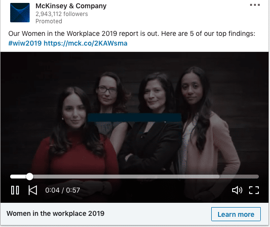
What stands-out in this ad?
If it’s possible, tie in social causes or show your brand beliefs. McKinsey & Company touches on a very sensitive topic skillfully by providing updated insights.
#100 – Corporate Finance Institute (CRI)
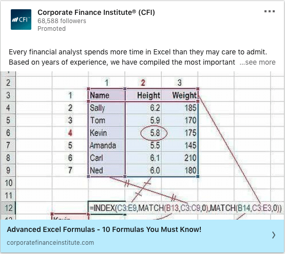
What stands-out in this ad?
While this might seem technical to most audiences, this is actually effective. See how they call out their audience (financial analyst) in the intro text. The content is extremely useful for that audience and the creative is something that the audience can relate to. Ad creatives doesn’t have to be artistic all the time.
#101 – Syfe
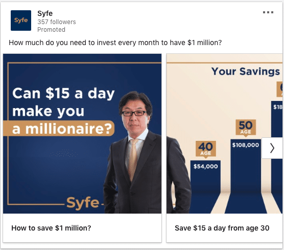
What stands-out in this ad?
Syfe maximises the carousel cards to tell their brand story. The intro text also sparks huge curiosity.
#102 – Syfe
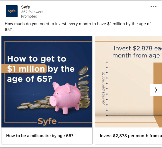
What stands-out in this ad?
Another ad variation from Syfe that dives into more specificity. Alot more statistics, graphs and projections in the carousel cards to build a compelling case for Syfe’s services.
#103 – National Australia Bank
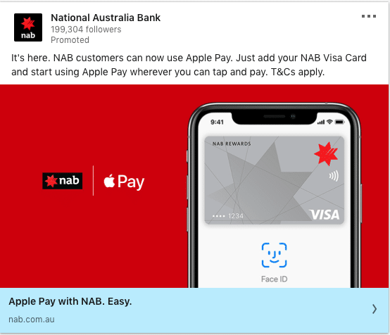
What stands-out in this ad?
Simple and effective awareness ad. A great product launch ad.
#104 – ELMO Cloud HR & Payroll
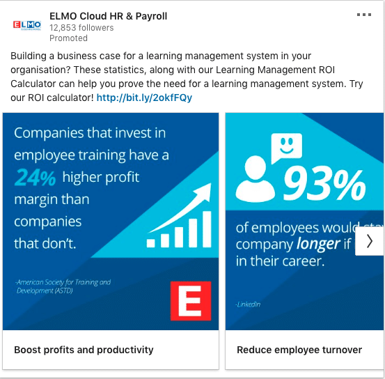
What stands-out in this ad?
To be honest, this barely made the list. There’s just way too much text squeezed into the carousel cards and intro text. But they do have the core elements in them. They asked a question, they included statistics and also have an offer. If they could reduce the amount of information and focus on the most impactful ones, then this would have been a killer ad.
#105 – Toyota Motor Corporation
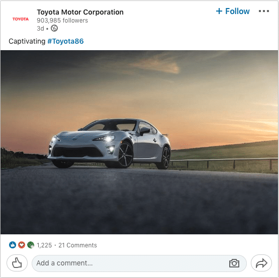
What stands-out in this ad?
Just an image will do when your product looks as stunning as that.
#106 – BHP
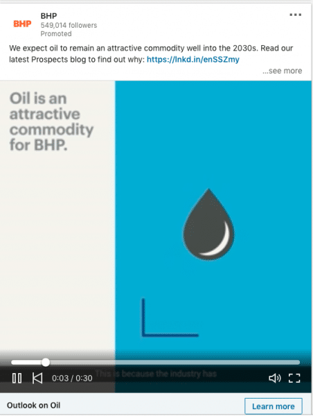
What stands-out in this ad?
1:1 videos are killing it on Linkedin. This is another example. It’ll give an advertiser so much digital real estate.
#107 – Singapore Tourism Board
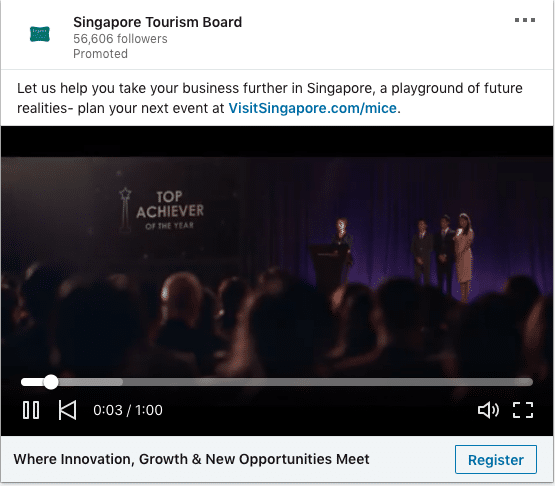
What stands-out in this ad?
Video works best if you have a strong story to tell. This is better as an awareness campaign.
#108 – Singapore Tourism Board
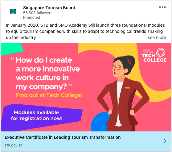
What stands-out in this ad?
A large number of Linkedin’s audiences are on the platform to learn new skills. This fits perfectly! Who would be better equipped to teach about tourism than the national tourism board themselves.
#109 – Airbnb
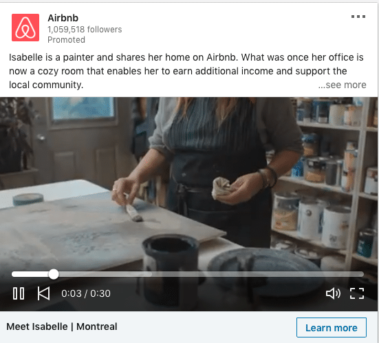
What stands-out in this ad?
This is an interesting angle. If you work with partners, you can feature them too! Use video especially if it’s a compelling story. Customer stories also works in this scenario.
#110 – Slack
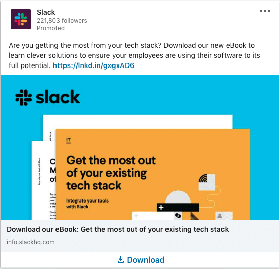
What stands-out in this ad?
Starting off with a strong question is impactful. The headline is also to the point and clear.
#111 – Slack
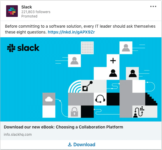
What stands-out in this ad?
What makes this ad awesome is not just the useful buyer’s guide content. They managed to stir up and challenge the IT leader’s knowledge. If you’re an IT leader, you’d like to find out if you have covered all your bases.
#112 – EY
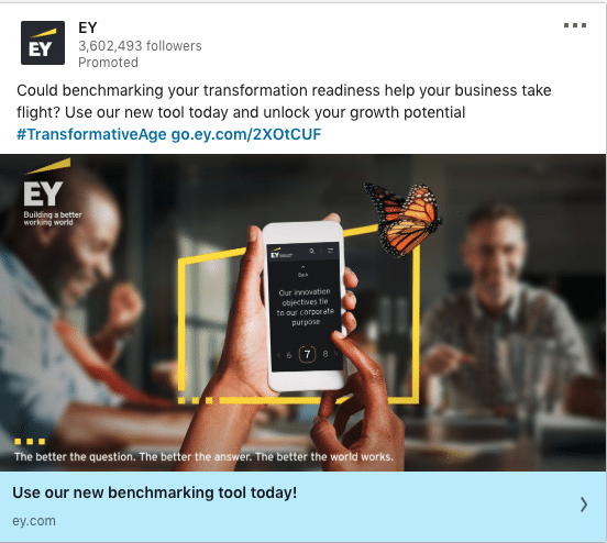
What stands-out in this ad?
Tools! We don’t see that enough on Linkedin. If you have a useful tool that helps your audience be better versions of themselves, use it! Most of the tools we see on Linkedin are not really useful or they might be used at the wrong stage of the buying journey. For example, we see tons of ROI calculators on Linkedin ads. Most audiences do not need an ROI calculator. Most likely, it will be the sales people themselves who calculate ROI for the client when they are ready. So most marketers are wasting tons of budget advertising their ROI calculators as an “awareness” piece. Don’t be that Marketer!
#113 – EY
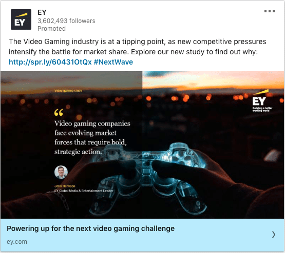
What stands-out in this ad?
Got to love the quote there. Another excellent thought leadership piece that is truly helpful and not promotional.
#114 – EY
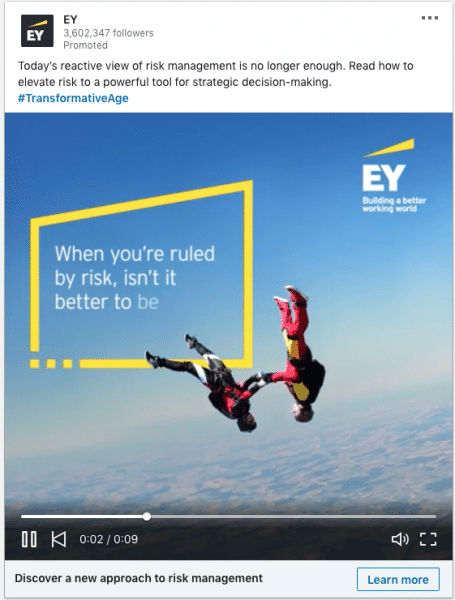
What stands-out in this ad?
See how 1:1 video does it’s magic here! Large video on Linkedin that brings your message alive.
#115 – EY
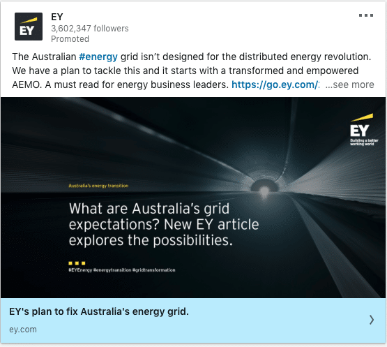
What stands-out in this ad?
Very strong call-out for their audience. If you’re an energy business leader in Australia, i bet you’ll resonate with this.
#116 – EY
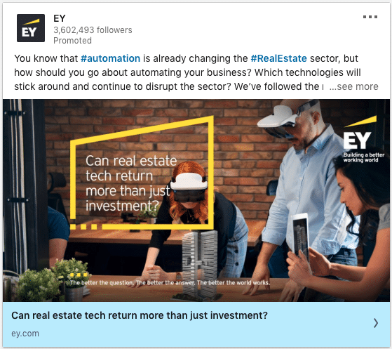
What stands-out in this ad?
Check out how they turn the headline into a question. That’s great! Did you also notice how EY keeps their brand consistent throughout all the ads? Masterclass!
#117 – IBM
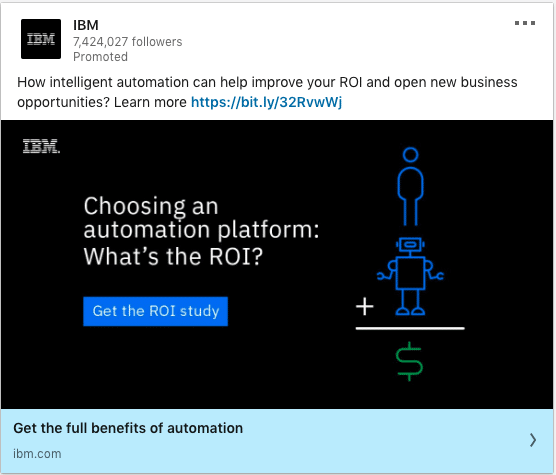
What stands-out in this ad?
Nicely done – As long as they are targeting the right audience. This would work best for audiences who are more ready to buy. But who knows, perhaps IBM has tons of budget and is able to splash this on awareness too (although i wouldn’t reccomend you do that).
#118 – IBM
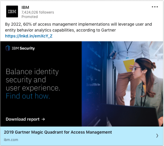
What stands-out in this ad?
Thought leadership at it’s best. Guess what, this isn’t even their content. Great way to leverage third-party authority to boost your message.
#119 – IBM
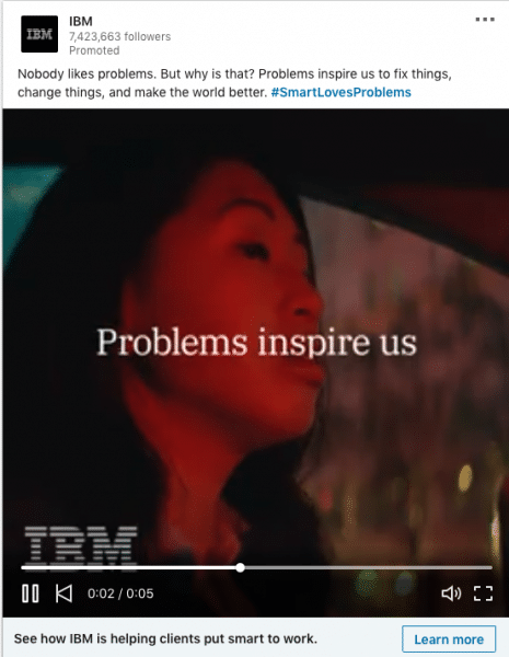
What stands-out in this ad?
1:1 video with a strong message = great brand awareness campaign
#120 – Facebook for Business
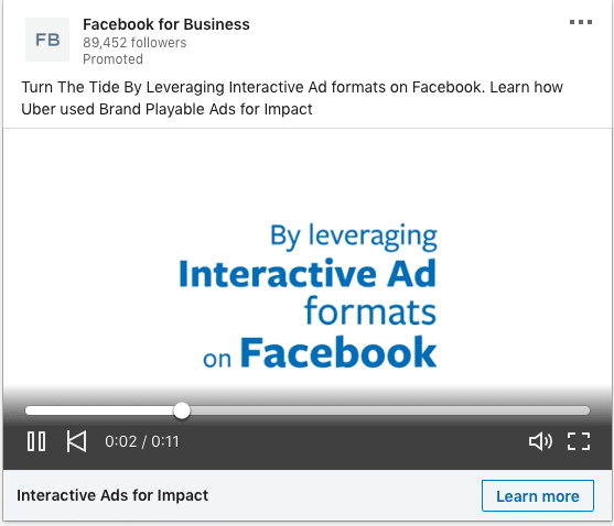
What stands-out in this ad?
Using a strong namedrop like Uber in the ad helps. The video goes on to show how Uber is using different Facebook ad formats to grow. It was a short infographic video with text. Short and sweet yet impactful message.
#121 – Think with Google
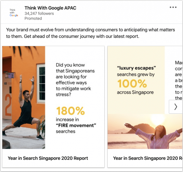
What stands-out in this ad?
Insightful statistics that are highly relevant to their audience. Good call-out of their audience by geography. Perfectly positioned thought leadership report.
#122 – Qualtrics Malaysia
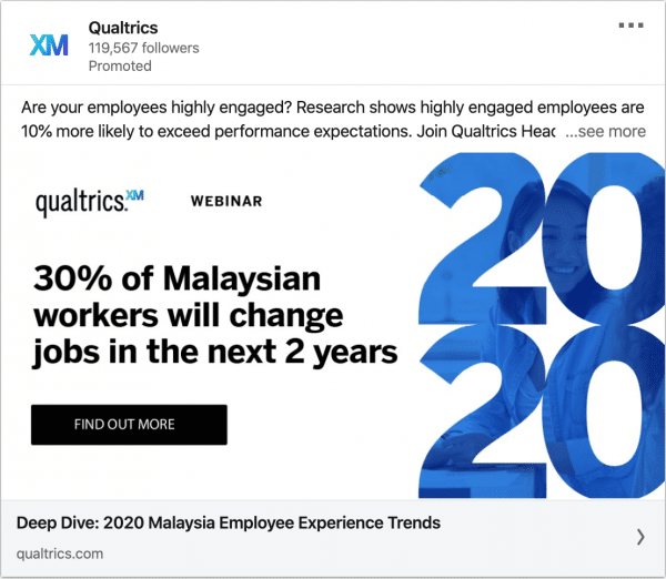
What stands-out in this ad?
Contextualising their data and report to the relevant audience. There is a huge curiosity factor in this ad. Their intro text started with a rhetorical question that challenges their audience. The use of statistics across this ad is impeccable. Making “2020” prominent throughout shows that it’s the latest update.
#123 – Qualtrics
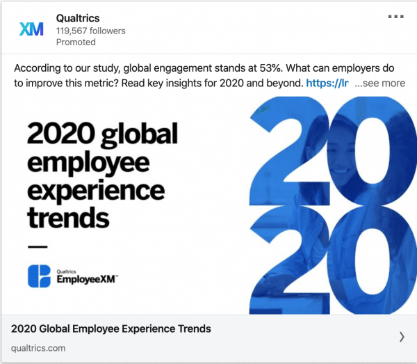
What stands-out in this ad?
For some companies, global targeting might make more sense. Qualtrics shows how it’s done in this example. Great call-out of the dates. The use of statistics makes it stand-out like an authoritative report.
#124 – Blueprism
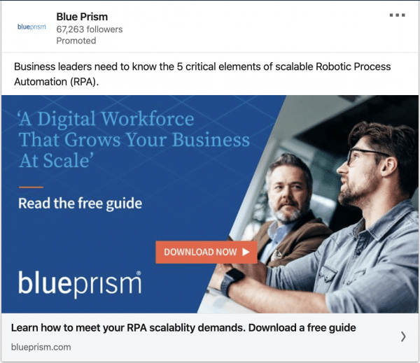
What stands-out in this ad?
Very precise on what audiences are going to learn. They could try testing a different color as the blue is too close to Linkedin’s native blue color. “Business Leaders” in the intro text is also vague. Are they IT leaders? CEO? CMO? It needs to be as specific as possible.
#125 – Splunk
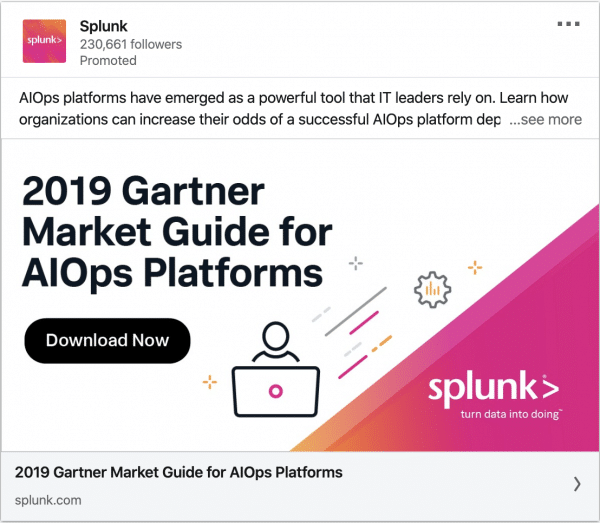
What stands-out in this ad?
This would make a great remarketing ad. If an audience is already aware of their problems and seeking solutions, then this market guide would be extremely valuable. Aligning themselves to Gartner also builds credibility for their brand. Borrow authority from others if your brand is small and growing.
#126 – Splunk
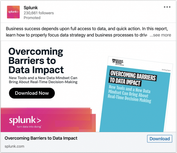
What stands-out in this ad?
The offer is a Harvard business review paper. That itself is already a strong pull because audiences need to purchase it themselves if they wanted to read. Instead, Splunk is giving it away for free. The intro text is clear what they are going to learn if they click and download. However, the intro text could still be more concise at 150 characters to avoid truncation.
#127 – Nutanix
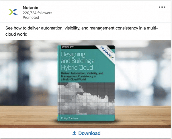
What stands-out in this ad?
Linkedin members come to LinkedIn to learn. With this mindset, offers like thought leadership, books and ebooks will attract members.
#128 – Nutanix
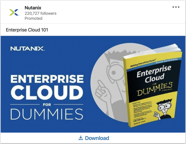
What stands-out in this ad?
Same reason as the previous example. This offer aligns with the mindset of Linkedin users. Majority of members are on the platform to learn.
#129 – Salesforce
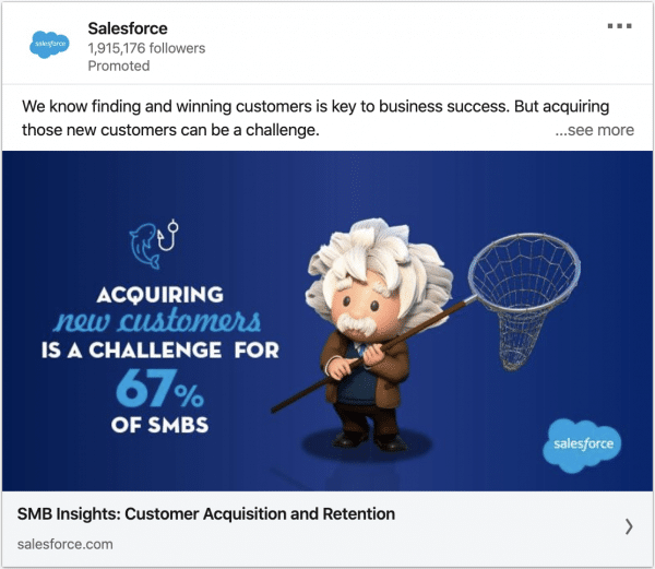
What stands-out in this ad?
The ad is very well branded and immediately noticeable. The Einstein theme has been built over the years. The headline calls out the audience really well. It’s clear that these insights are for SMB.
#130 – Apple
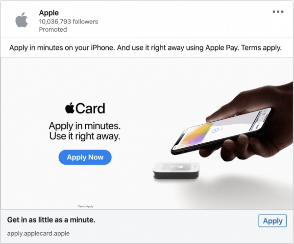
What stands-out in this ad?
Apple’s clean design and recognizable logo stands out. The value proposition is clear on the creative, making it quantifiable in terms of how fast they can get the offer.
#131 – Apple
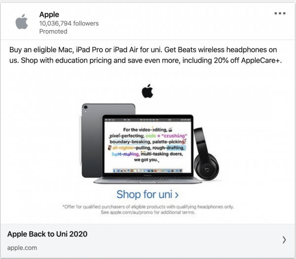
What stands-out in this ad?
Good call out of their student audience. The offer is clear with discounts for students.
#132 – Oracle
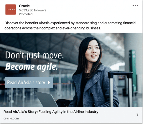
What stands-out in this ad?
Telling a story of your customer’s success builds credibility to your product. Being able to be specific about who the story is about it even better. Plan ahead and ensure you get Customer’s buy-in early for a case study. Nothing is stronger than your customers speaking out for you.
#133 – Schneider Electric
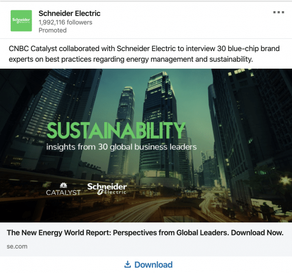
What stands-out in this ad?
Sustainability is a big topic trend on Linkedin. Schneider electric capitalize on this news trend to relate it back to their business. Trend jacking is really useful if you’re able to react fast and have an offer related to the trend. Other trends on Linkedin are International Women’s Day and Gender equality
#134 – Hubspot
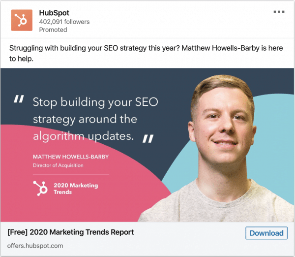
What stands-out in this ad?
If you’re big into SEO, you would know who this person is. Using an interesting and reliable expert catches the audience’s attention. Another thing that stood out are the quotes. The offer in the headline is also clear. The audience can see what they’ll be signing up for.
#135 – Hubspot
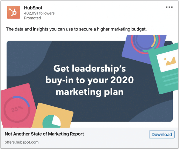
What stands-out in this ad?
Most companies are offering state of marketing reports already. In order to have a differentiated offer, Hubspot produced another angle: “Not another state of marketing report”. The intro text is clear about what the audiences will learn from this report.
#136 – Hubspot
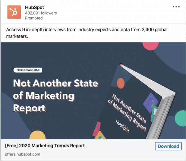
What stands-out in this ad?
The creative is unique. It shows a practical example of a book. Another thing that stood out was the use of social proof. Intro text showed that over 3,400 marketers were involved in this creation.
#137 – Hubspot
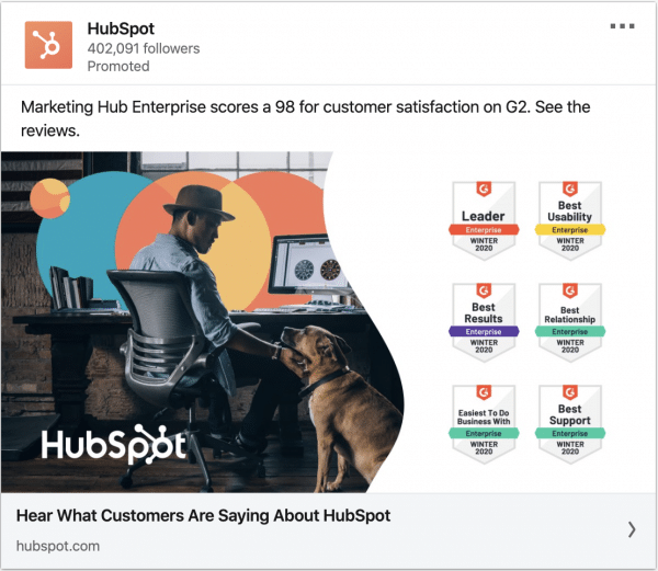
What stands-out in this ad?
This would be a good retargeting ad, showing prospects who are familiar and trust Hubspot why they’re the best.
Conclusion
If you’d like to develop a deeper understanding of social media marketing, consider taking our LinkedIn Sales and Marketing or Social Media Marketing Course. Please also feel free to browse our other digital marketing courses that are held in-person or online in Singapore.
Shaun comes from a rich background of B2B sales, social media marketing, demand generation, marketing operations and marketing strategy. Playing a key role in previous marketing agencies, Shaun had the opportunity to consult top brands like Grab, Oracle, Microsoft, Salesforce, NUS (and more) with their online marketing & go-to market strategy. With his vast experience in the industry, he is a trainer for the Digital Advertising, LinkedIn Sales & Marketing, and Website Optimisation (Conversion Rate Optimisation) courses here at Equinet Academy.